Statement of Intent
For my third project, I have chosen the theme of “objects”. A lot of this project will be centered around specific objects having a meaning and the connection an individual has with an object. I have chosen to do this as I believe as people, we gain attachments to certain things and it is entirely endearing to create a project about how someone connects with an inanimate thing so closely. I intend to take inspiration from other photographers to explore a deeper meaning behind a simple object and also photographers who experiment with extravagant organization of a photoshoot. My final gallery will consist of at least 10 refined images, though I acknowledge that photoshop during this project may be more difficult than ones I have done beforehand.
When I chose this project, a specific type of image immediately sprung to mind. Matching colour themes, thought out organisation and a strong message. That is why when I found the photographer Camilla Catrambone, I was very intrigued. It is clear from this artists images that a lot of contemplation goes into her work and she really dwells on how a photo connects with her. A lot of her work consist of family oriented themes. By this, I mean she has chosen objects that represent members of her family and even perhaps included a picture of them. With permission of course, I intend to do something similar and use an array of objects to represent someone close to me, whether they be friend or family. The second photographer I have chosen to research is named Jim Golden. similarly to Catrambone, Golden’s work has a meaning behind it. A lot of his work is some sort of social commentary, displaying a want for society to once again find interest in a topic that was lost long ago. His photos are very colour coordinated which gives a satisfying finish and the object often match in a way, offering the viewer a clear understanding of the message. My third photographer I have decided to research is Colin Wilson. This photographers work is a little more simplistic compared to the prior two and one could argue that a lot of his photos lack a lot of meaning. However, the reason I chose this photographer had a lot to do with the actual arrangement of his images. The final outcomes of his pictures are so even and in clear focus which is something I aspire to recreate as it would make this project even more professional. Many of the objects he includes also have contrasting textures or materials which can make you almost feel the image. All three of these photographers will have an impact on my work and it will be interesting to see how I incorporate each of there methods.
When I first chose this theme, I was excited about the endless routed I could take the project. “Objects” is quite vague and obviously I would have a lot to work with. I was immediately aware that I would have to carefully choose objects as there had to be some sort of deeper meaning behind them or they had to represent something in order to make the project more personal. I also new that my main angle of camerawork I wanted to use was a Birds Eye view as it captures a lot more and makes one feel closer to the picture. I knew I wanted to use objects belonging to different people and not only use things from one person, so I have a wider array to work with.
The beginning of this project may be a little difficult as I find out the exact route I want to go down, so my main goal is to find that route so that my journey through my work is clear and improvements shine as we go along. To ensure those improvements (As said previously) I will have a variety of things to shoot. Shoots will also take place both at home and in school as lenses on a DSLR camera and an IPhone camera may have different benefits-some things will also be easier to shoot at home as to not damage anything. I want to involve a shoot using object of my own (for example vinyls as those things are special to me) and I would feel much safer completing those shoots at home. The main focus of every image I take is to ensure a story could be told from it.
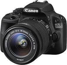
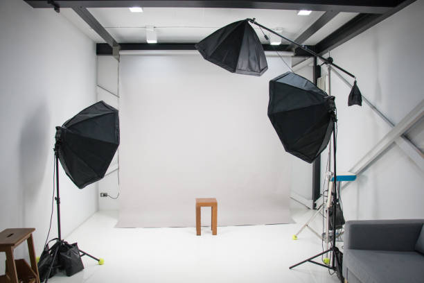
As hinted, I intend to use both a DSLR Canon camera as well as using my phone camera. Both types of lenses work differently in certain environments and one may be more beneficial than the other in specific moments. What is important is the fact both cameras are both equally as professional. I do enjoy using the DSLR are settings such as the white balance can be experimented with with could improve the final shot of an image depending on the material of an object I’m using. However, my phone camera is a lot more convenient and the quality does not falter, especially in an outside environment. I often find myself running into some trouble focusing the lens and dealing with the ISO on a DSLR, but every mistake does give me an image to add to best and worst. Studio lights will clearly only be available during school shoots, so for home shoots I intend who use natural lighting as it work best with the lens. For both types of shoots I will use an infinity curve or some sort of background that coordinates well with the objects in the foreground.
This will be my final project and photoshop work will be included for my final exam piece which begins in May, so this is a very pivotal piece of work. Certain tasks have been allocated to certain lessons, so I can keep on track with where I am and if I am falling behind. I often spent time dwelling on what to photograph on my last projects, but with this it is clear I don’t have time and thinking on my feet is needed. Writing pieces are to be completed at home to taking photos and photoshop take priority in lesson as that side of photography is often easier to do in a place where all the correct equipment is. The most important part is my final gallery which is to display all refined photos at the end of the project.
Carrying on from my previous projects, I intend to include the small “development thought tracking” text boxes as a way to further show my opinions on what I do and how I believe I could improve something. I will also be carrying on adding snips of any tutorials I use to enhance my (and the viewers) knowledge. After each gallery, I will also keep including the best/worst pieces of writing as it is a helpful and quick way to see what has worked this past shoot and the mistakes I made so that I could try and improve them next time. Best/worst also shows my understanding that a lot of this work is about trial and error. As always, feedback received from teachers is always encouraged. Whether it be digitally or verbally, it is very effective in getting me to understand how I could better my work. The evaluation after my final gallery has been completed will also give an insight into how I felt throughout the project as well as where I believed things went well/wrong.
When I chose this project, a specific type of image immediately sprung to mind. Matching colour themes, thought out organisation and a strong message. That is why when I found the photographer Camilla Catrambone, I was very intrigued. It is clear from this artists images that a lot of contemplation goes into her work and she really dwells on how a photo connects with her. A lot of her work consist of family oriented themes. By this, I mean she has chosen objects that represent members of her family and even perhaps included a picture of them. With permission of course, I intend to do something similar and use an array of objects to represent someone close to me, whether they be friend or family. The second photographer I have chosen to research is named Jim Golden. similarly to Catrambone, Golden’s work has a meaning behind it. A lot of his work is some sort of social commentary, displaying a want for society to once again find interest in a topic that was lost long ago. His photos are very colour coordinated which gives a satisfying finish and the object often match in a way, offering the viewer a clear understanding of the message. My third photographer I have decided to research is Colin Wilson. This photographers work is a little more simplistic compared to the prior two and one could argue that a lot of his photos lack a lot of meaning. However, the reason I chose this photographer had a lot to do with the actual arrangement of his images. The final outcomes of his pictures are so even and in clear focus which is something I aspire to recreate as it would make this project even more professional. Many of the objects he includes also have contrasting textures or materials which can make you almost feel the image. All three of these photographers will have an impact on my work and it will be interesting to see how I incorporate each of there methods.
When I first chose this theme, I was excited about the endless routed I could take the project. “Objects” is quite vague and obviously I would have a lot to work with. I was immediately aware that I would have to carefully choose objects as there had to be some sort of deeper meaning behind them or they had to represent something in order to make the project more personal. I also new that my main angle of camerawork I wanted to use was a Birds Eye view as it captures a lot more and makes one feel closer to the picture. I knew I wanted to use objects belonging to different people and not only use things from one person, so I have a wider array to work with.
The beginning of this project may be a little difficult as I find out the exact route I want to go down, so my main goal is to find that route so that my journey through my work is clear and improvements shine as we go along. To ensure those improvements (As said previously) I will have a variety of things to shoot. Shoots will also take place both at home and in school as lenses on a DSLR camera and an IPhone camera may have different benefits-some things will also be easier to shoot at home as to not damage anything. I want to involve a shoot using object of my own (for example vinyls as those things are special to me) and I would feel much safer completing those shoots at home. The main focus of every image I take is to ensure a story could be told from it.
As hinted, I intend to use both a DSLR Canon camera as well as using my phone camera. Both types of lenses work differently in certain environments and one may be more beneficial than the other in specific moments. What is important is the fact both cameras are both equally as professional. I do enjoy using the DSLR are settings such as the white balance can be experimented with with could improve the final shot of an image depending on the material of an object I’m using. However, my phone camera is a lot more convenient and the quality does not falter, especially in an outside environment. I often find myself running into some trouble focusing the lens and dealing with the ISO on a DSLR, but every mistake does give me an image to add to best and worst. Studio lights will clearly only be available during school shoots, so for home shoots I intend who use natural lighting as it work best with the lens. For both types of shoots I will use an infinity curve or some sort of background that coordinates well with the objects in the foreground.
This will be my final project and photoshop work will be included for my final exam piece which begins in May, so this is a very pivotal piece of work. Certain tasks have been allocated to certain lessons, so I can keep on track with where I am and if I am falling behind. I often spent time dwelling on what to photograph on my last projects, but with this it is clear I don’t have time and thinking on my feet is needed. Writing pieces are to be completed at home to taking photos and photoshop take priority in lesson as that side of photography is often easier to do in a place where all the correct equipment is. The most important part is my final gallery which is to display all refined photos at the end of the project.
Carrying on from my previous projects, I intend to include the small “development thought tracking” text boxes as a way to further show my opinions on what I do and how I believe I could improve something. I will also be carrying on adding snips of any tutorials I use to enhance my (and the viewers) knowledge. After each gallery, I will also keep including the best/worst pieces of writing as it is a helpful and quick way to see what has worked this past shoot and the mistakes I made so that I could try and improve them next time. Best/worst also shows my understanding that a lot of this work is about trial and error. As always, feedback received from teachers is always encouraged. Whether it be digitally or verbally, it is very effective in getting me to understand how I could better my work. The evaluation after my final gallery has been completed will also give an insight into how I felt throughout the project as well as where I believed things went well/wrong.
Coggle Mind map

Colin Wilson Research

Composition
This image is obviously a studio shot that includes studio lighting. The fact that one side of the objects are darker than the other makes it clear that the lights are on the left side of the camera. The contrasting materials of the items create an illuminating effect e.g. the shine of the steel. The difference in materials also makes you think about if there is a specific reason for them being chosen. I see a potential theme of curves and round finishes. The stacking of the objects and the curvature they create makes me think it may follow the Fibonacci spiral which could explain the intriguing and coordinating nature of the photograph. The foreground (the items) are quite clearly the main focus of the image and they are highlighted by the infinity curve that gives the impression of a void. Depth of field is also played with as the distance between the objects and the background is noticeable. In my eyes, the aperture could be set to f/16, as everything is in clear focus with no haze. The base of the colander creates leading lines as they are quite elevated and they go out of view. Diamonds on the vase also create leading lines, although they are a bit more subtle. The fact that the image is black and white makes it a bit complicated to determine the white balance and ISO, though I could predict the ISO around 800 sure to the shot being inside. Cropping of the image is very tight with the edges being all even and the items are at eye level. All of these things ,I believe, further emphasizes the enticing nature of the image.
Context
"Wilson was the first child of Arthur and Annetta Wilson and was born on June 26, 1931, in Leicester. His father was a shoe industry worker. When he was eleven years old, he enrolled in Gateway Secondary Technical School, where his enthusiasm for science really took off. He had already written A Manual of General Science, a multi-volume collection of articles on many facets of science, by the time he was 14 years old. But by the time he graduated from high school at the age of 16, his interests had already shifted to literature. It was significant that he came upon George Bernard Shaw's writing, especially Man and Superman. He began writing novels, plays, and essays seriously after reading a lengthy sequel to Man and Superman, which led him to believe he was "Shaw's natural successor." " I found this information on Colin Wilson's Wikipedia page
Connection
The fact this photo is black and white, I feel, can metaphorically speak about a message. For this project, I intend to take some images in black and white and some in colour, so they contrast and create an interesting final effect. In some of my images, I hope I can recreate the clear all in focus finish. This image is quite simplistic, yet interesting which is a result I would like to achieve. One could imagine these objects mean something to the photographer, but they also might not. It is my goal to create images using objects that I or someone I know, can connect with personally.
Comment
I enjoy the simple nature of this picture and I also enjoy that despite the simple execution, the layout has very clearly been thought through. Colin Wilson is known for his contribution to creative arts, whether that be photographic or literary. Due to his influence, this photo of his should not be brushed aside just because it can be easily recreated. This picture really makes me question how I could create the same effect of organization, but while using objects that have a much deeper meaning.
Camilla Catrambone Research

Composition
Camilla Catrambone is a modern artist whose work is mostly about her personal memories of her family and what she thinks represents them as people. This image is taken from a birds eye view, giving us clear sight of the objects in frame. I imagine this picture was taken in a studio with professional lighting above as everything is equally lit with shadows. This light really enhances the colours involved. There are mainly neutral tones involved with a slight pop of yellow that your eyes are drawn to, which is obviously strategically placed. Every item is placed accordingly, either grouped or by itself which gives a satisfying finish to the image. The satisfaction is only furthered by the fact that the whole image is in focus which makes me believe that the aperture is around f/16. I believe the ISO to be around 800 as this is an indoor shot with quite a lot of light. The picture is cropped tightly, so we see nothing out of frame(that is also helped by the black background). At the bottom of the image, their is a jacket that is majorly cropped out with the initials in the center. The line leading down the image from the box to the initials makes you wonder about the personal meaning of the photo. The turquoise of the turtle pin on the jacket may call attention to the rule of thirds, as the bright colour with be placed in a bottom corner box if the template were visible. In my opinion, this picture has an underlying feeling of something reminiscent of pop art. The sharp lines, shapes, colours and message give me an inkling of pop art, which says a lot about Catrambone's work if it gives a feeling of some of the most influential creative movements of the 20th century.
Context
Camilla Catrambone is a portrait photographer of sorts, yet her carefully arranged images -- homages to her family members -- feature no smiles, faces or even bodies. Instead, the Florence-based artist creates photographs of her relatives using personal belongings, ranging from leather satchels and handkerchiefs to blocks of cheese and cookware.
The series, simply titled "Portraits of my Family," shows these everyday treasures arranged in aesthetically organized, curiously captivating snapshots. "When I started doing this project, I felt that the objects belonging to my relatives, starting from the ones of my beloved grandparents, were still full of energy and were capable of reminding me of moments I shared with them," Catrambone stated in an email to The Huffington Post. "I started to feel the need to use them to go back to a precise memory- I found this information on https://www.huffpost.com/entry/camilla-catrambone-family-portraits-personal-treasures-homages_n_3402134#:~:text=Camilla%20Catrambone%20is%20a%20portrait,smiles%2C%20faces%20or%20even%20bodies.
The series, simply titled "Portraits of my Family," shows these everyday treasures arranged in aesthetically organized, curiously captivating snapshots. "When I started doing this project, I felt that the objects belonging to my relatives, starting from the ones of my beloved grandparents, were still full of energy and were capable of reminding me of moments I shared with them," Catrambone stated in an email to The Huffington Post. "I started to feel the need to use them to go back to a precise memory- I found this information on https://www.huffpost.com/entry/camilla-catrambone-family-portraits-personal-treasures-homages_n_3402134#:~:text=Camilla%20Catrambone%20is%20a%20portrait,smiles%2C%20faces%20or%20even%20bodies.
Connections
The theme of colour in Catrombone's work is something I wish to explore as I feel colour is a big part of my life personally. The personal meaning behind her images is also an idea I intend to use by including objects of my choice, as well as my friends and family members. In terms of the camera work, I hope I can incorporate a mix of such sharp colours with such neutral tones as well as a clear, clear anf focused final image. From what I can see, there is no photoshop on this image which I think highlights the authentic intention.
Comment
I really enjoy the work I have seen from Camilla Catrambone. It is clear she puts a lot of effort and though into her images and carefully considers any message that she wants to convey. The positioning of everything she photographs is very enticing and makes you want to search the image for more. The image I have chosen is one of my favorites of hers, much due to the colour scheme and the memories she wanted to inspire whilst taking the picture.
Jim Golden Research

Composition
Lots of Jim goldens work is created from his want for the viewer to appreciate the simplicities of objects and everyday life aesthetics. This photo is quite clearly taken from a Birds Eye view as the objects are laying flat against a sky blue background. The placement of the instruments have been very strategically coordinated with different shapes occupying different areas of the image, making sure the frame is full. Jim golden has clearly opted for a neutral colour scheme and has perhaps used the blue background to accent the intricacies of the instruments’ textures. I also feel as though different types of instruments were used to give the image a small chaotic feel, but the final outcome obviously holds a pleasing, symmetrical finish. I believe this is a studio shot because of the amount of items they have been able to access and the well lit room is noticeable due to the shine on some of the metal, for example the symbol. I feel as though there is not a very shallow depth of field because of the f stop possibly being around f/16-22. Everything being in clear focus definitely adds to the brightness of the image. To further the brightness, I predict the white balance was put onto an auto setting with the ISO being 800. There is also an essence of 3D due to the shadows of the instruments against the background which makes the picture almost pop out at you. The cropping of the image is expertly done as the edges are even and there is just enough space around the instruments to keep your attention on them.
Context
"An award-winning photographer and director specializing in still life and products, Jim brings an artist's eye and an enthusiast's passion to his work. He strives to capture the pared-down essence of his subjects, rather than impose a false sense of beauty upon them. The viewer is invited to enjoy an often-inanimate object for its stark simplicity or quiet quality. Jim is a consummate professional with 20+ years of industry experience. His easy-going attitude and sense of humor ensure that clients not only receive top-quality work, but also enjoy the process."- I found this information on https://jimgoldenstudio.com/INFO-AND-CONTACT/ABOUT-JIM/1
Connections
The colour scheme of Jim Goldens work is really inspiring for me as neutral tones is something I wish to explore as very as well coordinated set ups of objects that blend well together. The theme of instruments here is a really good example of using objects that represent you or something that means a lot to you in life which is a really important element I capture in this project. The cropping of this image also inspires me as I think the perfect amount is captured and the even sides don't leave that much useless space of the blue background.
Comment
Jim Golden's want to explore the simplicities in live in an artistic manner is something I thoroughly enjoy. The way he executes his ideas is very pleasing and the hard work put into each image is worthwhile. The layout of this image in particular makes it seem almost like a game. The viewer is meant to search for a new instrument as you do not know if their is a smaller one hiding within the lines of the acoustic guitars are huge drums.
Moodboards
Collections


Singular(one focus)


Practice shoots
Shoot plan
|
For this shoot, I am going to attempt a Colin Wilson style photo with one object as the focus and using a textured infinity curve. Like the image I have stated, I intend to explore a bright and colourful finish in photoshop. Though, I am going to use a circular perfume bottle as the focus with a black background(and maybe also experiment with a patterned background. I plan to do this shoot in school as a studio shoot. I will use a low level of light, so shadows are not too harsh and the glass is not overexposed. I will put the bottle in different positions and angles to give several different effects. I am going to use a DSLR camera to obtain some of my photos, though I will use my Iphone camera to take majority of the photos to see if the lenses make any positive differences and because I find my work to be more of a higher standard when I use the phone camera. My intention is to experiment with the F/stop aperture, so that I can see if I prefer the blur and haze effect rather than everything being in full focus. I may experiment with the white balance as well, though I think the main setting will be auto as this is a studio shot. Around 20-30 photos will be taken, so that I have enough to play with for my final outcomes/gallery. The aim of this shoot is to be the beginning of my photography of objects that have some meaning to me personally.
|


|


Best and Worst

In my opinion, this is my best image. The unfocused texture in the foreground brings a lot of mystery to the image. The bottle is almost peeking around from behind and it is immediately noticeable due to the fluorescent colours floating around the glass. The contrast between the bright colours and the void of the background brings a lot of character to the picture. I really like that the angle of the camera is going against the position of the bottle.
|

In my opinion, this is my worst image. The lighting of the bottle is very dull and I think the texture of the background is too overexposed. I do not like the positioning of the bottle as it is a bit too out of frame. The leading lines in the background are a little too prominent and make the glass look fuzzy. The ISO was not set on auto which I think was the cause of the lackluster tone of the picture.
|
Development 1
https://www.youtube.com/watch?v=bO566yGr-HM- I used this tutorial to kick start ideas for my 'Objects' project. With picking this theme, I came to the realisation that photoshop is going to be a bit more complicated than my previous two projects, as at first glace these photos could be very plain and ordinary. This glowing effect was entirely experimentation and to see how I felt completing the technique and testing how well it fit with one of my pictures. If I am to carry on using this technique throughout my project, I will have to mix it with another (for example layering) as the final outcome is not anything special even though it took a lot to get to it.
Original image
|
|


Final image

Shoot plan
|
These next photoshoot will all taken consecutively in the same hour as an array of objects were brought in for me to experiment with. For these shoots, I plan to focus on over head shots, so that all (or at least the majority) of my objects are in view. I intend for most of these photos to be quite cropped and zoomed in so they do not require an infinity curve. However, I will place the objects on a wooden table, so that is it does creep into view it gives a warm tone and texture. I will be doing this shoot in school without using studio lights as I feel natural light will benefit these shoots more. The light intensity will vary as I plan to take pictures of things next to the window and far away from the window. I will be using both the Canon DSLR and my phone camera as the lenses differ and outcomes may be better than other depending on object material. The angles and aperture of my photos will vary as do get a wide range of images to refine. I want to take pictures of objects in full view and objects close up, so F/stop will be important for that. As this is multiple shoots in one I intend to have around 40-50, or possibly more, photos to ensure my galleries are consistent and I have options for photoshop.
|
|
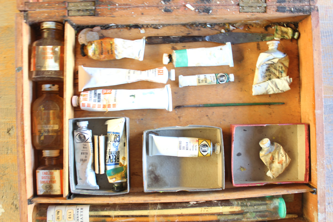
This is a paint box that was brought in by my photography teacher. It once belonged to her grandfather who often found painting therapeutic and used it a distraction from past traumatic events. He used the easel and paints as a way to express himself.


Best and Worst

In my opinion, this is my best image. I feel as though the lighting creates quite a rustic feeling that matches well with the wooden texture. I like that the image is cropped quite tightly, so that non of the table behind is visible. The contrast between light and dark is very evident as the top of the image is in shadow whilst the middle-lower is captured in light. The unkept nature of the paint tubes also adds to the natural essence of the picture.
|
In my opinion, this is my worst image. This image is majorly over exposed with natural lighting coming from a close window. It is also not in clear focus. The birds eye view angle is not on center as one corner is higher than the other. I feel as though the white balance and ISO were on the incorrect settings (WB:sunlight) (ISO:200).
|
These badges also belonged to my photography teacher. I believe every badge is from a different stage in life, so it interesting to see a journey through the different achievements written on them.


Best and Worst

(This image box has cropped some out unintentionally) In my opinion, this is my best image. The close up focus of one badge was an idea I was experimented with and I thoroughly enjoyed the outcome. I am fairly certain the aperture was around 5.6, so other badges scattered around were still visibly, but not entirely in focus. The white balance and ISO were both on auto which I think was a good touch as it got the warm tone on the wood.
|

In my opinion, this is my worst image. The arrangement that is visible is not something I enjoy, though clearly not much can be viewed. I am fairly certain the white balance was on cloudy and the ISO was around 200-both contributing to the dark outcome. I also do not like the angle at which the photo is taken as the edges where the table is bare are not even.
|
This is my school blazer. The uniform is obviously a part of my identity at this moment in time, however it very much so lacks individuality, as does every school uniform. So, over the years I have collected badges of things I love so that I have a way to express my interests on school grounds. That is why I picked them as the main focus. The main theme I have in my badges are books/reading.


Best and Worst

In my opinion, this is my best image. I think this shot has a sort of cinematic feeling to it because of the angle. It looks as though it is a still image of the camera about to pan over the entire blazer. The shine coming off of the badges due to the natural light adds an element of texture as writing on the badges is emphasized. I see a slight haze on this image as I believe I experimented a bit with aperture. It makes it so the middle of the blazer is most in focus and the badges towards the top are more blurred, yet still equally as noticeable.
|

In my opinion, this is my worst image. This image turned out looking slightly rushed and not thought out well. The ISO was turned to 400, so it is darker and the blazer (due to the dark blue colour) does not show up well. The angle is a birds eye view which was intended, but the angle is tilted and not intentional. Everything in this image is very matter and bland. No camera setting gave this image life.
|
Shoot plan
|
This photoshoot will be taken in the comfort of my home as the object I will be using is quite old and delicate and is also precious to a member of my family. I will use different angles for this shoot as the jewelry box alone can be interesting to view, but I will also obviously take pictures of the rings that reside inside. I intend to take pictures of multiple rings at a time with them all in focus and also take pictures with the focus on a singular ring whilst other in the background are slightly blurred out. I also intend to keep the birds eye view theme that I have going and take the ring draws out and arrange them whilst still in the draws, ready for an over head shot. For quite wide shots, I will use a dark, cold background to contrast the soothing tones of the box and the sheen of the rings. Only natural light will be available as the flash from my phone camera tends to leave an image quite over exposed. As just stated, I will be using my phone camera due to the fact that this is a home shoot and it is a good resource that I have easy access to. There may be less settings to play around with, but I normally find my work turns out much better when I use my phone. I plan to take between 30-40 pictures as I feel photoshop for this shoot will be simpler as this is an object I personally grew up being around.
|

|
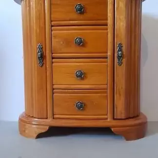
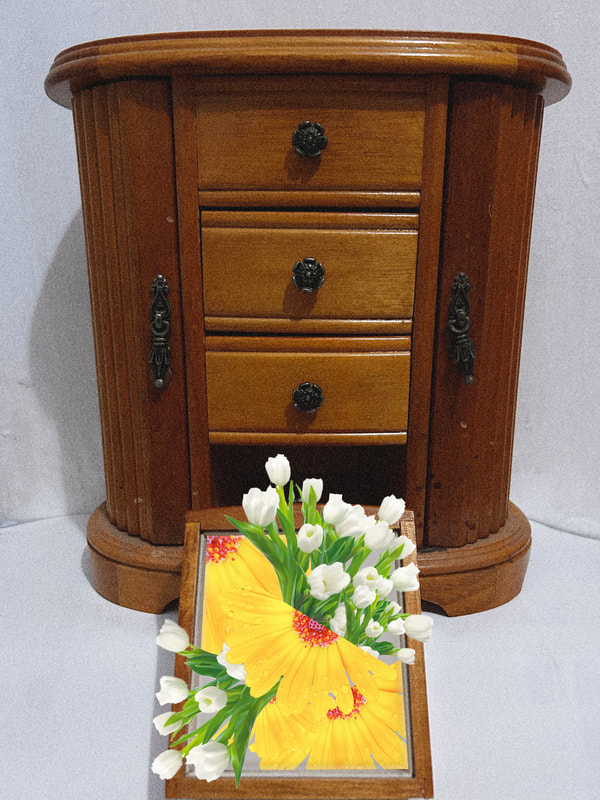
This jewelry box belongs to my mother. Inside the small draws holds many family trinkets that hold many stories. However, for this shoot I have chosen to focus on the rings. Many of the rings belong to my mother and once my grandmother. It was nice to analyze them and make them the center of this shoot for my meaningful objects project.


Best and Worst

In my opinion, this is my best image. This image was taken with an Iphone camera, so the outcome is quite crisp. The tone and level of warmth that was added to the image was increased at the time, leaving behind the pinkish glow. I like how the engravings of the biggest ring are visible and strong. The flash of the camera gives a nice shadow to the copper and almost accents it's age. I also enjoy how the background fades into itself as the rinds in the foreground take up full focus.
|

In my opinion, this is my worst image. I do not enjoy the composition as the jewelry box is not in the center and the white piece laid down beneath is not fully covering the floor. The lighting is quite generic and does not add anything eccentric to the wooden texture of the box. The doors are open which uses more space, however the insides are dark, leaving little to no surprising effect.
|
Development 2
I feel as though the technique of "layers" is most fitting and beneficial for this project. The idea of an object having backstory and the layers representing the history is something I would like to pursue. This was my first attempt at the technique with an image that I like. I am somewhat happy with the outcome as it's design is intriguing, but I feel as though something could definitely be added on to a different outcome to make it a bit more complex and interesting.
Original image

|
|


Final image

Development 3
This experimentation with layers wasn't as successful as the previous development. This one is quite blocky and square with very harsh lines between each cop and paste of the ring draw. Though both picture are connected as it is the jewelry box and ring draw, the photos do not blend well together. I do like the use of the opacity on the draw, though the effect is minimal as the cut away point for each image is quite visible.
Original images


|
|


Final image

Development 4
Out of all developments so far, this is hands down the most successful. I think for the rest of my project developments, this is the route I wish to go down. Downloading an already existing background that fits with my chosen image has made the process of this technique a lot smoother. I could not find a tutorial that showed the process of my exact vision, so this was a lot of trial and error. However, I think the final outcome is the right thing to try and replicate throughout.
Original images


|
|


Final image

Shoot plan
|
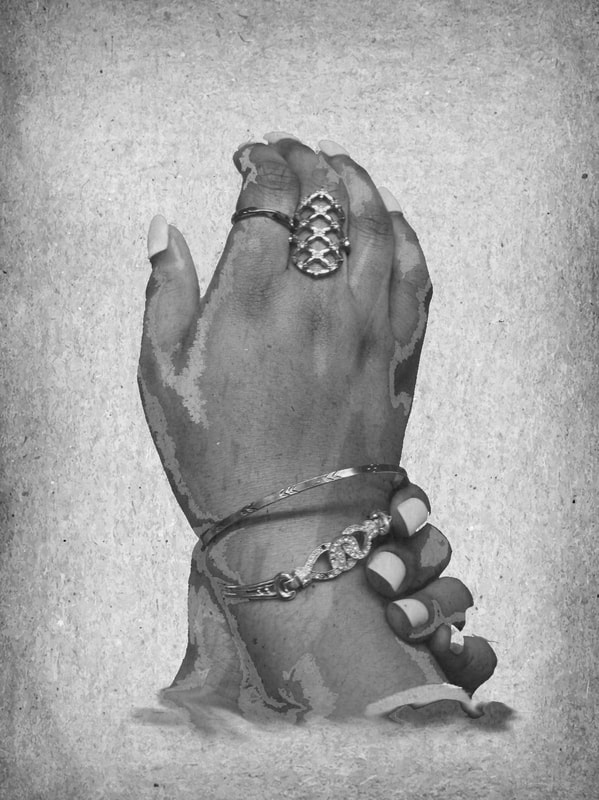
This photoshoot shall be taken in school as it will require a model. I will be using one of my photography classmates to be a hand model of some pieces of jewelry they hold dear to them. The jewelry I wish to mainly capture is rings, though bracelets may also add some flare to the final images. This shoot fits in nicely with the previous shoot I did that involved my mother's jewelry box. I believe that I intend to intertwine both shoots in an outcome on photoshop. This will be a studio shoot with some use of studio lights. I will also be using a Canon DSLR camera, though I will experiment with my phone camera to try different angles and colouring/tone. I will be using a plain background to give the essence of an infinity curve, though I think I will try and do some photos with the models hands held towards their chest. The birds-eye-view angle will be kept to e minimum in this shoot as I wish to keep the camera looking straight ahead. I intend to take around 20-30 photos, so I have enough for a gallery and enough to experiment with photoshop. In the end, the images will be quite tightly cropped as there is no need to have such a wide environment for a shoot focusing on one part of the body.
|
|

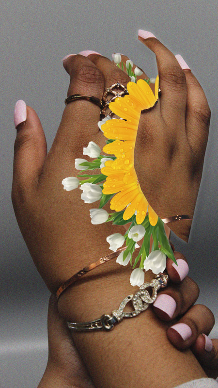
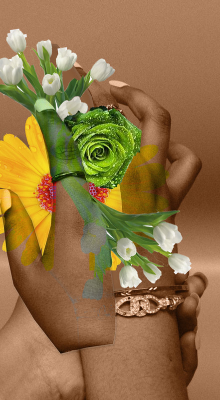
The jewelry used in this photoshoot belongs to the model as I wanted my focus to have a personal connection to the person displaying it. One golden bracelet used was gifted to the model by their grandfather as is a stark remembrance of him. A number of the rings used was also gifted to the model by their sister and the ring with the white gem was actually the first ring their sister ever gifted them.


Best and Worst

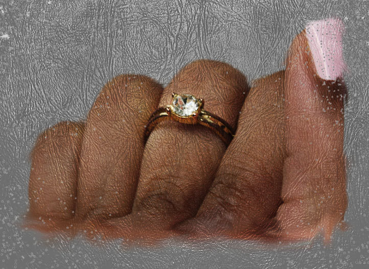
In my opinion, this is my best image. I experimented with different angles and felt this angle was the most appropriate to play with the aperture. I feel the f/stop was at 5.6 for these types of images that focused on one ring. The lighting could have been a bit more vibrant, but overall I feel the infinity curve ended up adding the brightness to the final outcome.
|

In my opinion, this is my worst image. It is very clear to see the lighting in the photo is inadequate. I was experimenting with the ISO (it was around 200) and the outcome was entirely too underexposed. The placing of the model's hands is also displeasing as they are emerging from the corner of the image and, inadvertently, not all in frame.
|
Tutorial I used for inspiration: https://www.psdvault.com/photo-effect/create-leafy-face-photo-manipulation-photoshop/
Development 5
Original images


|
|


Final image

Development 6
Original images


|
|


Final image

Development 7
Original images

|
|


Final image

Evaluation
The theme I chose for this project was different types of objects. I explored different types of objects such as objects personal to friends, family members and professionals. I believed that this project was the best for me to explore as the opportunities are so vast and it was important for me to delve into the personal stories of people's belongings. After long consideration, I finally decided to focus mainly on how important jewelry can be to people. This project has allowed me to expand my creative ideas and improve my skills of interaction and listening to the stories of individuals. I think the journeys of everyone is an important things to focus on so we can better understand each other as the human race.
My favourite part of this project was taking pictures of the rings with a hand model. At this point in the project, I knew I wanted to focus on rings, so the close up shots I got of different rings really motivated me. Being able to hear the stories of the rings and bracelets made the experience of the photoshoot flow a lot easier. I also enjoyed my final opportunity to improve my camera skills. As this is the last project, I saw it as an opportunity to round up everything I have learnt about camera work and put it all into this project.
Once again, my photoshop skills have developed more. I think trying to expand my previous knowledge of layering and trying to make it into something new had been a challenge. If you compare my photoshop techniques with my previous project, I think the style of my 'Messages' was a lot more suitable for me as my main subject of 'feminism' was something I could connect with. However, you can clearly see the improvement with each photoshop as the outcomes turn out slightly differently each time. A tutorial provided by my teacher helped me solidify the idea of layering one of my pictures with an already made background.
I would like to improve my navigation of photoshop. As I have expressed, it took me a while to get a grip on what technique I wanted to use and my final decision still might not be loved by everyone. I think I need to be more clear, confident and direct with my own execution of a technique as I think that would have majorly benefited the outcomes. The tutorial I used was not the greatest to follow because (based on the images) an older version of photoshop was used for an explanation. I used what I could understand and my outcomes from the year and my exam work was the product of that and overall I think it could be entirely improved.
The three photographers I chose to take inspiration from were; Colin Wilson, Camilla Catrambone and Jim Golden. I feel at the beginning of my project the main photographers I chose to take the most inspiration from were Camilla Catrambone and Jim Golden. In the beginning, I liked to explore the overhead shot to get every part of a project in frame and to emphasise the effect of the organisation. Both Golden and Catrambone are quite similar with the birds eye view aspect and the inclusion of colour. Both photographers are very bold in their work and everything is in focus to maintain simplicity. Out of both photographers, I feel as though Camilla Catrambone is the one this project resonates the most with. This is due to the clear familial message in a lot of her work. She likes to use objects and photos of her loved ones to be the focus of her work which is one of the main meanings of this object. Golden also uses objects to express his love for certain subjects, but Catrambone explores the lives of others. Towards the end of this project, I feel as though inspiration from Colin Wilson became the forefront. I turned more towards groups of objects under the same umbrella (e.g. jewelry) or even just objects of their own. I began to explore different levels of objects (e.g. bracelets on the wrist and rings on the hand). I think overall, the Colin Wilson approach was best for me and the singular objects are a lot better to focus on in photoshop as you can give a lot of attention to a certain area.
During this project, I really enjoyed my work on the camera (focusing on singular objects-rings and bracelets). I enjoy playing around with aperture, so that the rings were emphasised and the background is out of focus. I also enjoyed the shots I took of the models hands as the lighting and background were perfect for what I wanted to achieve. The fact each ring and bracelet had an individual story made the outcome more personal and I felt it was important to me to turn attention to at least a few of the rings, so that they could be admired.
I feel as though the most successful part of this project was finalising my weebly website. It was important that this project was at just as much of a high standard as my previous project. It was very important to me that each of my project pages had the same/similar layouts, so the professionalism can be maintained. I believe it would have affected my outcome in photography if I let any standards slip during this final push to my desired grade. The continuity of standards also displays my improvements and how far I have come through my journey in photography.
As I have expressed, the problem I encountered the most was trying to figure out the photoshop technique I wanted to use. Throughout my time in photography, photoshop has been the main thing I have struggled with and with the pressures of the final exam I think I overestimated my abilities on the app. I have also explained my bump in the road with the trouble I had using the tutorial. I tried to find others, however I could not find any that I could follow that would lead to the idea I had in my mind.
I learnt things in this project through trials and tribulations. Input I gained from teachers and peers really helped me in trying to get to my final outcome. The feedback I received on my progress tracker after every big milestone (e.g. statement of intent) was so beneficial as I also got face to face explanations on what I can do to improve my work. I was never told that what I was doing was not good enough, only I needed to develop my already existing ideas into something bigger and I believe my developments are clearly noticeable.
If I were to do this project a second time around, I would focus solely on singular objects. I have not really done anything more with my first few sets of images I took besides my 'Best and Worst' as I find it hard to work around. It is clearly visible that I am more comfortable with the small idea of jewlery that I set my mind to. When it only came to a few weeks before the exam I started to doubt myself that what I was doing was not good enough to achieve a grade I wanted and that is because of those first sets of images. Overall, if I had another chance I would do even more dwelling on how I would approach this project and what I could do to get that final outcome that I have worked so hard for in the past few years.
21st April, first exam, I will not add any more information or make any changes to the work above
Original images

|
|


Final image

Original image

|
|


Final outcome

Original images


|
|


Final image
Original images


|
|


Final image

Original images


|
|


Final image

Original images

|
|


Final image

Original image

|
|


Final image
Original image
|
|


Final image
Original images |
|


Final image
Original image
|
|


Final image

Original image
|
|


Final image

Final Gallery


I started off the exam with one type of layering and ended with a more advanced way of layering whilst including other photos within the original image. I am proud of the way everything turned out.
