Satement of Intent
For my second project, I have chosen the theme of 'Messages'. The main message I am presenting through my work is the idea of feminism and empowerment. I have chosen to do this because the subject matter is very important to me and a lot of other people, so many can connect with what I am trying to accomplish through my photography. I intend to take inspiration from photographers who have also wanted to convey the importance of feminism and incorporate their style of work into my own take on it. These images that I take will become my 'Final gallery' after I refine them in photoshop. Similarly to my project beforehand, this gallery will have at least 10 refined images to ensure that my standard of work is accurately presented. I may also with to choose a selection of photos from this gallery and pictures from smaller galleries throughout my project to create a sketchbook of my work as I believe a physical copy will be just as important as this digital one.
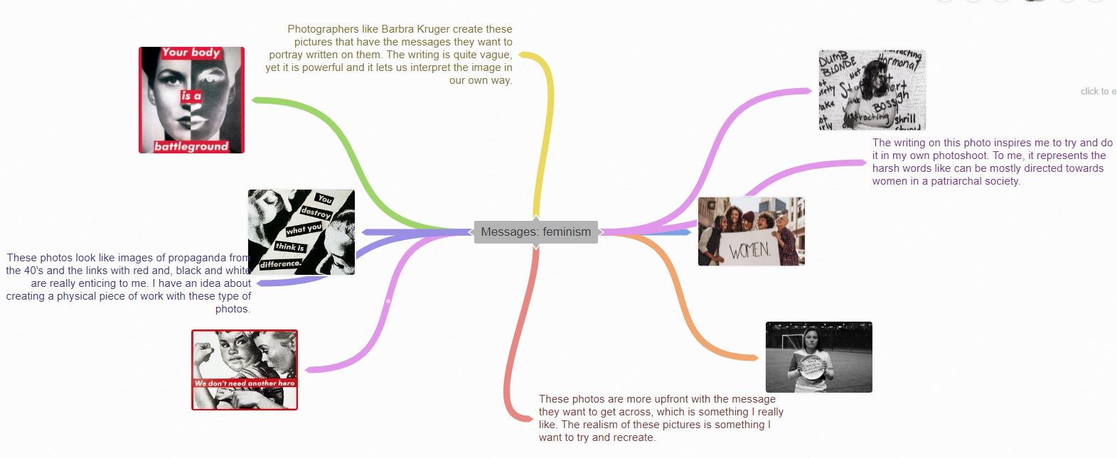
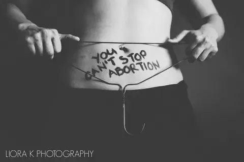
As I have said previously, taking inspiration to follow through with your idea is a common trend and it is quite important. I think with this project especially because the idea of women empowerment is now such a widespread thing it is great that we can follow in each others footsteps when expressing our views through art. On that note, the photography that I immediately thought of when I started this project was Barbra Kruger. Her style of work is so well known and eye-catching and not to mention it has had a huge impact on popular culture. The big blocks of red in her images against the black and white backgrounds really convey the extremity of her message. I feel as though you can't think about exhibiting the importance of women's rights through photography without outlining the influence her work has had. The second photographer I am looking at it is Abigail Heyman. Her work is a lot less explicit than the other two photographers I have chosen, but that is exactly the reason I chose to look at her work. It is something you need to analyse a bit to get the true message of (or at least your interpretation of it). She has thought a lot about the technical aspect of her work, for example the image I will choose to break down could have the use of the rule of thirds. When I want to make my images in this project to be a little more implicit, her photography is what I look to for insight. My third and final photographer is Liora K. I chose her as the focus of a lot of her work is a matter of major importance right now and always has been. Abortion rights have always divided any society and with the legality being wavered by the supreme court recently, Liora K's work is something people need to look to for hope. She does not sugar-coat anything with the black paint she uses to write on her models and that method is something I will definitely use. The black and white overlay highlights the seriousness of the subject. The way she uses a variety of models without showing their faces accentuates the truth that billions of different people will be affected by decisions made by those in power. All of these photographers communicate their opinions through their own styles and I am glad I have a wide range of techniques to learn from them to forward my work journey.
When I first chose this theme, the title I was given was just 'Messages'. This gave me free reign to think about something that is important to me and present it in my own fashion. I was debating between putting this project under 'Messages' or 'Identity' because in these circumstances these two things can be fairly similar. I started to consider either doing the focus on feminism (which ended up being my final decision) or the LGBTQ+ community. Both are vastly important to me, but I chose to go with feminism and women's rights as the infringement on them has been at the forefront of what I have seen in the media recently. I obviously thought to use a female model for my shoots and the idea of using makeup in different ways came to mind. For example, using eyeliner to write on the face (inspired by Liora K) or putting a full use of makeup on only one half of the face (inspired by Barbra Kruger). To expand on that, I thought about using lights in different ways to call attention to specific parts of the model. I am going to create a mood board to further enhance any ideas that may come to mind.
One of the main goals of this project is to show my progression through my photographs. To obtain that goal, I intend to follow through with a variety of shoots. The main location for the majority of my shoots will be in school as the models and technical advantages are more easily accessible (for example better cameras or lighting). I want to begin with a shoot involving the use of makeup as it can be easily enhanced in photoshop which would make the photo stand out. Though I have a preference for completing my shoots in school that is not to say I do not want to take my work in a more independent direction. I aim to do at least one shoot from home using a family member as a model. This project is personal for me, so to have someone close to me be a part of the finality of the journey would make it even more distinctive. The main focus for all of these shoots are for the final edits to be of a high standard.
The shoots taking place on professional grounds will be completed with a Canon DSLR camera as I used for my first project. The ISO and White Balance can be altered frequently of those types of cameras which is something I enjoy because it is easy to find the correct 'aura' for a photo. However, for home shoots I am more inclined to use my mobile phone camera. I predict I will not like the outcomes as much as I do on the manual camera, but using it is a way to make my work more varied and independent. I will be able to access studio lighting better in school shoots, so they will be used a lot. I also aim to use coloured sheets over the lights for some photos to differ them. For the home shoots, I have some handheld lights that I will be able to hold out of shot to give a coloured effect. A white background will also be used for the photos to create an infinity curve. The previous photoshop technique I used was a mirror tactic and it was quite basic seeing as though it was my first chance at photoshop. With this project I intend to do something a little different as I will not be taking photos of objects or things in nature. People will be the main focus. Text box will obviously be included with my final edits for replicate the style of Barbra Kruger, so that will be a difference in the last gallery of my 'Texture' project.
This project is the second project of three. I intend to complete this project a few weeks after we come back in September 2022. I definitely need time to complete a few more photoshoots as if I do not, there will not be enough for my final gallery or sketchbook. Another 2-3 photoshoots I feel would be enough as I could use multiple photos to edits from each shoot and I think that will be enough to show my progression. Over the summer, I intend to complete a home shoot, so that the work load when we come back is brought down. The main focus in school is to develop the photos in photoshop and ensure that I have enough high standard work for my final gallery.
It is key to explain my developments wherever I can, so when I edit pictures I add little sections and give an understanding on what it is I have done and how I got there. For example, a few of these development sections have tutorials that I have added to show that I learnt a specific thing from somewhere else. My images also have best/worst annotations to show that I understand where I need to improve, but also acknowledge that I have succeeded in some areas. Additions that teachers give me on my progress tracker or any verbal feedback that they give me are really helpful when it comes to me improving. Also, as I am doing shoots at the same time as other students I can get input from them on if there is anything I can do to better my outcomes. Once my final gallery is completed, I will write up my evaluation. This section will include things such as what I believe I have done well and what I think I could do better if given the chance. This evaluation point will give an insight into what I think about my journey and what I can do to better the next one.
Coggle Mind Map
Barbra Kruger Research

Composition
This is an image by Barbra Kruger that was taken around the late 90's. The obvious thing that stands out about this image is the bold red and white writing. It was a really good idea to overlap with those colours because they are quite reminiscent of propaganda, so people cannot help but be interested in reading it. Barbra Kruger is known for announcing her pro-choice views and women empowerment in a society dominated by males, especially in the 80's and 90's. The black background/infinity curve also accents everything else in the photo. This is clearly a studio shot and I can imagine studio lights have been set up above the model as parts of her body (especially her hair) are being lit up. As the image is black and white I cannot really tell the setting of the white balance and with the picture being a bit pixelated. I cannot really tell the ISO either, but I in my opinion it is somewhere around 800 as it is an indoor shot. I also believe the aperture to be around f/11 as the model is in focus. The camera is angled above the model and is looking down at her which I think makes the photo more personal as she is staring into the lens. This angle could also represent something deeper, such as the public eye closing in on the model. The positioning of the model herself is very pleasing. Her body is covered with darker clothing, which I think is intentionally done to blend in with the bottom left. From the neck and up, everything seems to be a lot more bright and the fact that her head is directly in the center gives her hair enough room to be one of the most eye-catching things about the photo. I think the rule of thirds has been used in this picture as it looks as if the models face is the sweet spot, though it could be quite difficult to tell as it is a portrait photo. In my opinion, the plan for this shoot has been very well thought out and the idea of getting a message across using writing over the top of a picture is very intriguing.
Context
"Barbara Kruger was born in 1945 in Newark, New Jersey. Kruger briefly attended Syracuse University, then Parsons School of Design in New York City, where she studied with artists and photographers Marvin Israel and Diane Arbus. In 1979, Kruger developed her signature style using large-scale black-and-white images overlaid with text. She repurposed found images, juxtaposing them with short, pithy phrases printed in Futura Bold or Helvetica Extra Bold typeface in black, white, or red text bars. Kruger addresses media and politics in their native tongue: sensational, authoritative, and direct. Personal pronouns like “you” and “I” are staples of Kruger’s practice, bringing the viewer into each piece. She demands that we consider how our identities are formed within culture, through representation in language and image." - I found this information from: https://www.thebroad.org/art/barbara-kruger
Connections
This image is untitled, though known as the 'Just be yourself' photo. That quote followed with '100% natural' I think is in reference to standards of the time pushed by media, as the photo resembles that of a magazine cover. Barbra Kruger's work always has a message behind it and I think that is very important in photography, especially this project considering the focus. I think this project will show my development drastically if I take pictures that have some meaning. I would also like to incorporate the contrast of red, black and white into my work for photoshop as I think it shows the urgency of the message. The way she frames and crops a lot of her photos make us focus on something specific which is ideal in making people consider what your work is about. I hope my work can mirror the professionalism and meaningful nature of her images. The red outlines of Barbra Krugers images is a theme I see myself using throughout the entirety of this project.
Comment
I really enjoy this style of photography because it is very present in today's media. Expression through art, I believe, is more talked about than ever before, so being able to share beliefs in this simple yet powerful way is amazing. A lot of this photographers work centers around rights and stereotypical thoughts about women and the way she confronts that stigma and shuts it down with her work is very admirable. This style is also so iconic and well known that I feel once someone sees the bold red it is immediately recognized as Barbra Kruger. Feminism and gender equality is something I am passionate about, so Barbra Kruger's work is definitely something I will be looking to for inspiration.
Abigail Heyman Research
Composition
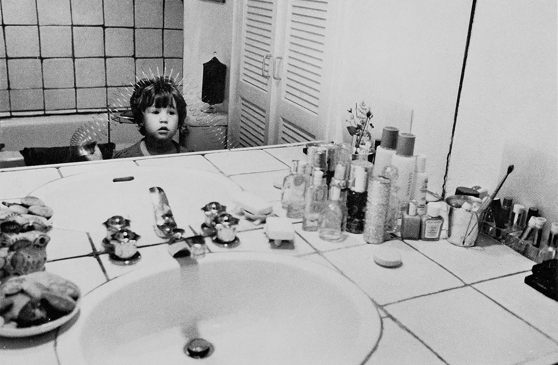
This photo by Abigail Heyman was taken in the early 70's. The simplicity of the pattern of white tiles and the careless placement of the things on the counter is what makes it so powerful as you want to figure out what message it is trying to tell you. The camera is angled slightly downwards which I think accentuates how young the girl is. In my opinion, the slinky prop the girl is holding further highlights the innocence of her. The angle is also meant to capture the beauty products on the counter. This photograph was obviously taken in a home which is made clear by the lack of infinity curve. I think the fact the photo is in black and white is good because the lighting may have not been the best in the setting, but the black and white also makes the White Balance difficult to determine, though it was most likely something that represented the 'Auto' setting. As this was the 70's there was no editing in photoshop, so the photo must have been natural. I predict the f/stop to be somewhere around 11 as there is no major blur effect to this image. Shutter speed would not have been used as the picture is very still. In my eyes, the image is best in black and white because I think it represents how straightforward growing up as a girl was in the 70's. The leading lines of the tiles (in the reflection of the mirror) take your eyes directly to the young girl. Due to the involvement of the mirror, the grounds may be difficult to point out, however the foreground is the chaotic nature of the counter, the middle ground is the lone girl and the background is the undecorated wall. The rule of thirds has been used in this image as, in my opinion, the products on the counter act as the sweet spots. I really like the positioning of the young model because Abigail Heyman was able to capture the longing stare of the girl and the products calling to be used. The picture is not very cropped at the sides as a lot of things needed to be in frame, however the top and bottom are cropped to bring the attention to the center. Overall, the message this picture is trying to convey was very successful due to Heyman's well thought-out idea.
Context
"Abigail Heyman (August 1, 1942 – August 28, 2013) was an American photographer and feminist. Her 1974 book Growing Up Female became an important text for the feminist movement.
Throughout her career she published photo essays about subjects, especially those related to women’s lives, that had been considered too personal or trivial for photojournalism. Though her work is most identified with the feminist movement, as Liftin told the New York Times, “as a feminist, she was not so much about marching. She took pictures that showed what the marching was about.” "- I found this information on:https://bildersturm.blog/2019/07/07/abigail-heyman-growing-up-female-a-personal-photojournal/
Throughout her career she published photo essays about subjects, especially those related to women’s lives, that had been considered too personal or trivial for photojournalism. Though her work is most identified with the feminist movement, as Liftin told the New York Times, “as a feminist, she was not so much about marching. She took pictures that showed what the marching was about.” "- I found this information on:https://bildersturm.blog/2019/07/07/abigail-heyman-growing-up-female-a-personal-photojournal/
Connections
Photography is all about perception and there are lots of ways someone could perceive this image. In my opinion, when a really meaningful photograph is in black and white the message becomes more powerful as you can bring in you own interpretation of colour. In some of my images, I hope I can recreate the grainy, black and white feel. Simple pictures such as this one, in my opinion, are important to include in any photography project as to not forget the natural essence of the hobby. For the majority of any shoots I may do, I will most likely only use one model as the fore focus just like in this picture. I feel as though I may perhaps use a mirror at one point and show my version of societal pressures but on women.
Comment
I love how this picture has been planned out. In my opinion, the meaning of this picture is how early on girls start to think about the way they look because of societal norms. I interpret this image like that because of the beauty products scattered around and the girls seems to be enthralled with herself in the mirror. I feel as though this photograph is a powerful way to represent the thoughts on a lot of young girls minds (especially is the 70's). As a young women, this image speaks a lot on how we put too much pressure on ourselves because of how we think we should grow up to be.
Liora K Research
Composition
In my opinion, the way this photo by Liora K is framed straight on at eye level is important as the obvious focus of the photo is going to be the midriff (the foreground) because of the subject that warrants the writing on the models stomach. The way the hanger acts as an outline for the writing further emphasizes Liora K's opinion on abortion. In other words, the prop hanger acts as leading lines. I think the photo was intentionally done in black and white so the attention would remain on the writing as the black paint and metal of the hanger is enhanced by the lighter skin. If the rule of thirds grid was placed on the image then the writing would be in the center box which is purposefully done to highlight the importance of the meaning. This photo was clearly taken in a studio as studio lighting is being used to create the shadows of the models arms and the side of their torso. A black board was used for the background to give the impression of an infinity curve, so that we solely focus on the foreground. We can also see a dim light shining off of the board. The shoot being in a studio may have also meant that the ISO and White Balance were set to auto. There is also a possibility the ISO was set to just a low setting as the photo is very sharp, though it is hard to tell because of the photo is black and white finish. I believe the aperture was around f/22 as the image is in clear focus despite the slight grey hue. The way the image is cropped tightly is very significant as we cannot put a face to the model which I think accentuates the fact that abortion rights do not just apply to one person, but to a whole demographic of unique people. I do not think much photoshop was used to refine this picture (besides the change of filter) as it could have removed the directness of it. In my eyes, this photo has done really good job at bringing attention to a serious subject in a straightforward way.
Context
"Intersectional feminist activism has always been a part of Liora’s photographic work and has been a guiding force in several internationally recognized and published projects such as The Feminist Photos, Attractive & Fat, and The Expose Project. Since 2012, Liora's activist work has been published both nationally and internationally. She continues to try and be an amateur - engaging with the medium and her subjects with level of love and curiosity." - I found this information from:https://liorakphotography.smugmug.com/About
Connections
The idea of having a model alongside writing is key to this project, so this picture is giving a lot of inspiration for a possible shoot. Simple portrait or landscape pictures of models I use will go a long way once I refine the final message in photoshop. From my viewpoint, the black and white essence is the best way to convey a serious message as there is no colour to brighten the mood, so I will most likely also use a black and white filter in some of my final pieces. The tight cropping of this picture is also something I see myself doing to insist on any point I want to make Perhaps I will also use a prop to further enhance the message of my photography.
Comment
The simple, yet powerful execution of this photo is very intriguing. Abortion rights have always been a very hot topic and are something I am very passionate about, so the way Liora K has executed this shoot is very relevant. The writing accompanied with the hanger show that taking away the right to abortions will only stop safe ones and in my opinion this is a perfect way to stick that point in everyone's minds. Writing on models bodies is a great way to make the image more personal, so I think Liora K has done a brilliant job enforcing her opinion through photography.
Moodboards


Home experiment


|
|

|
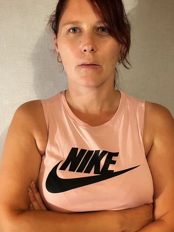
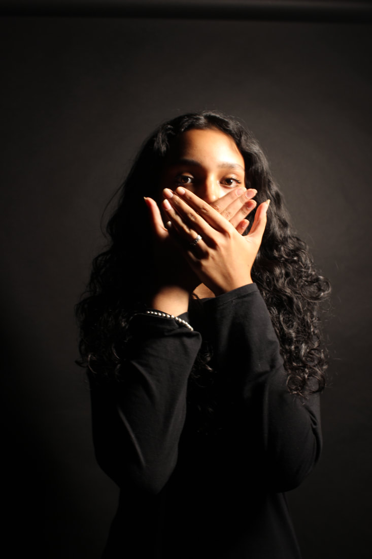
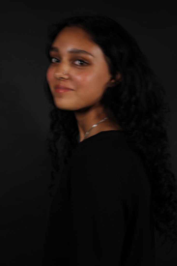
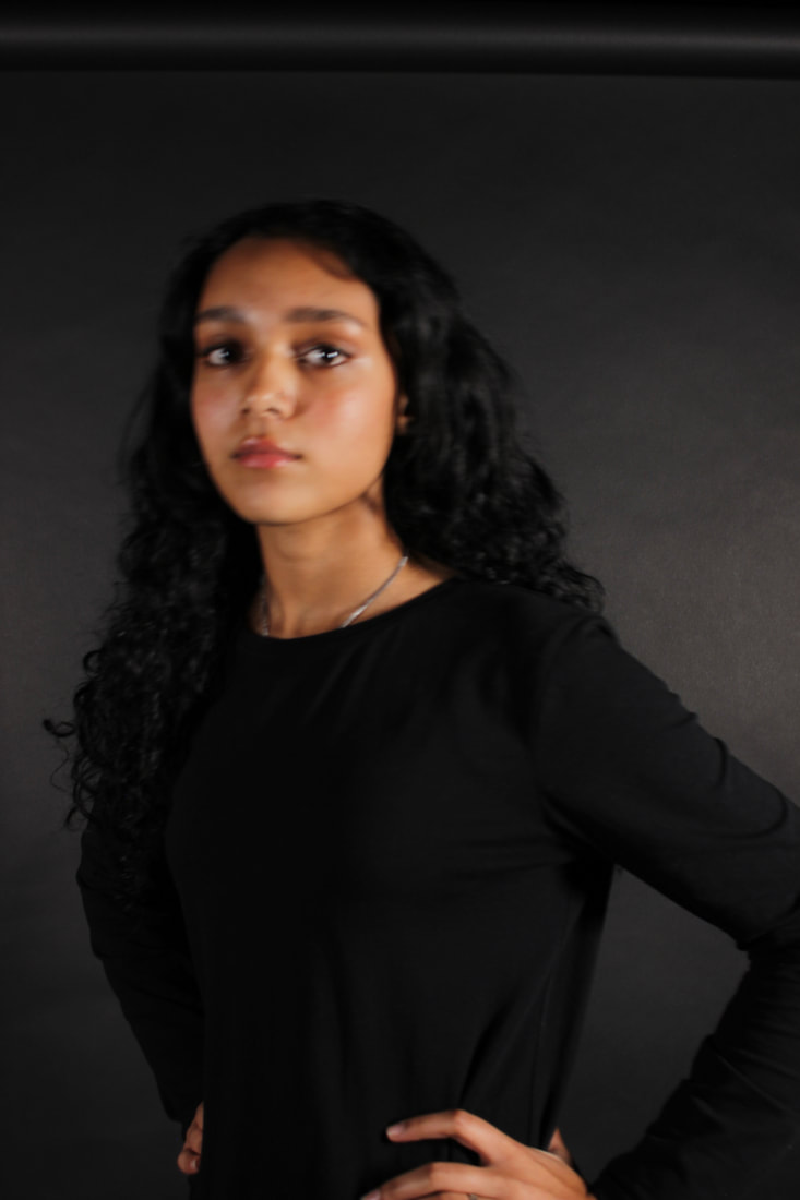
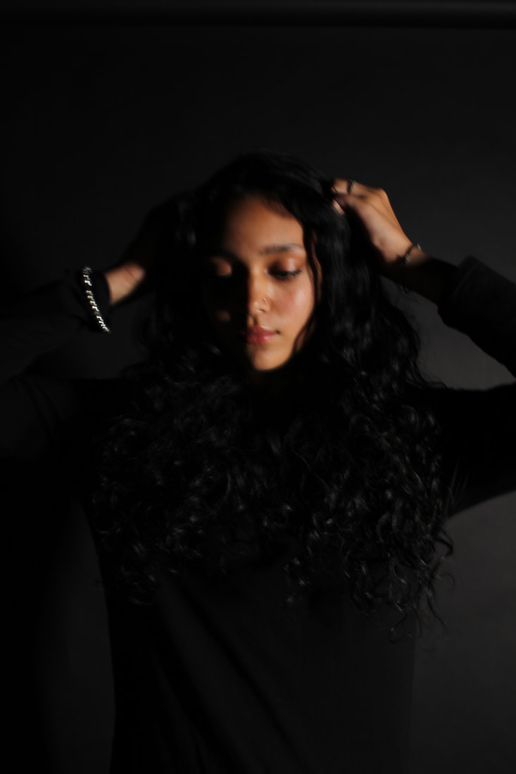
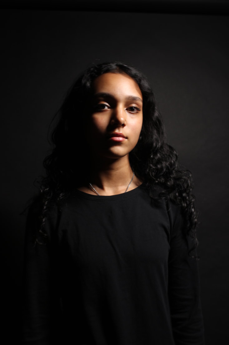
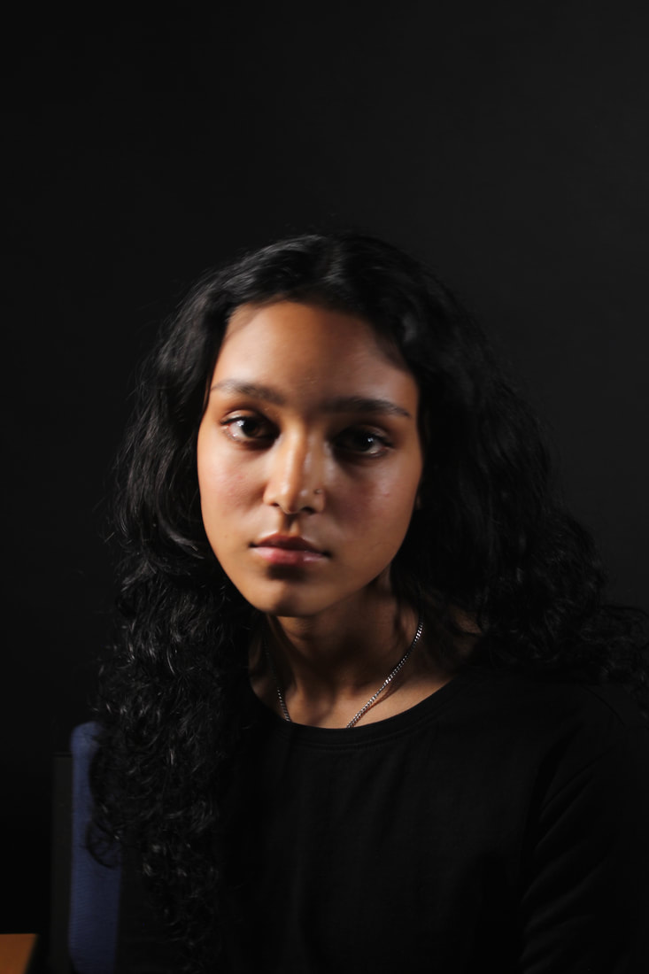
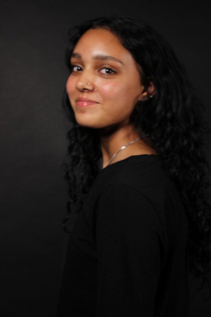
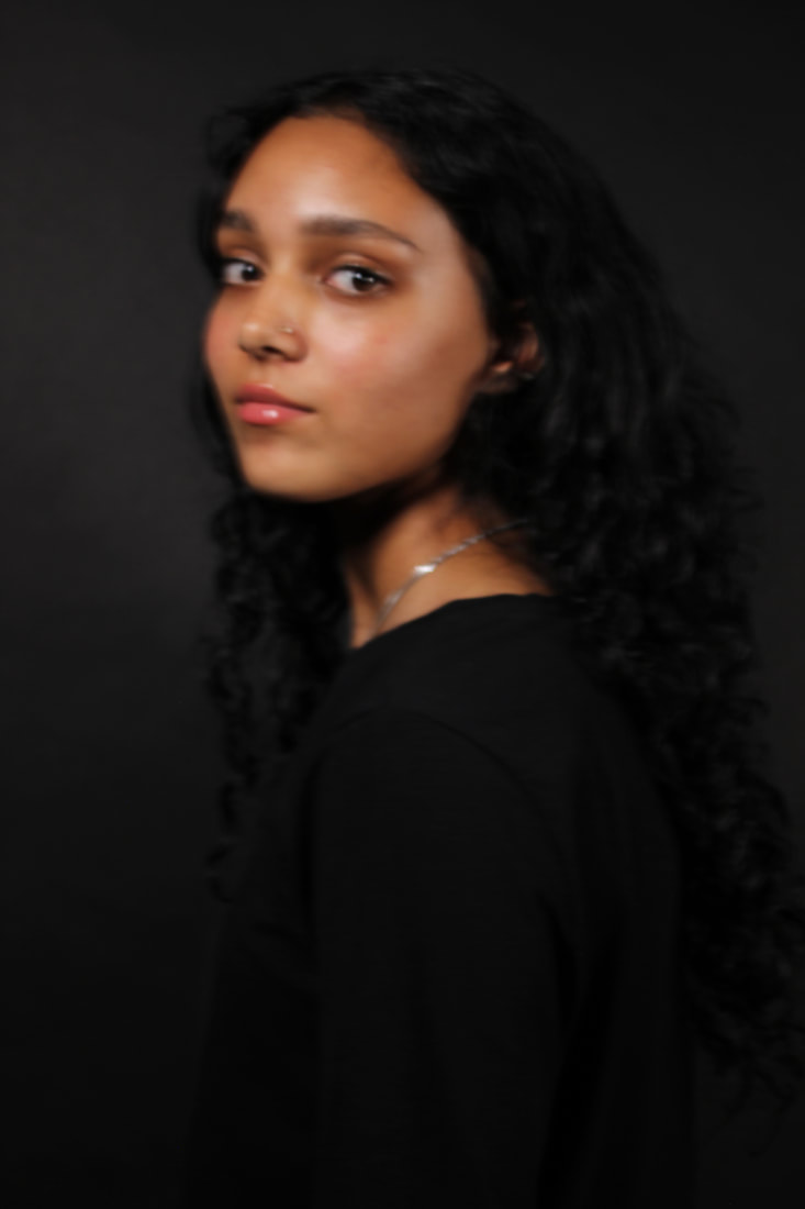
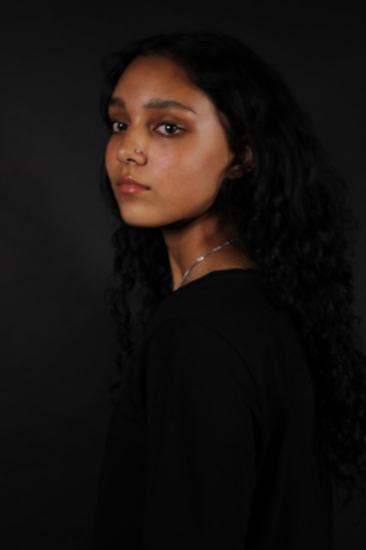
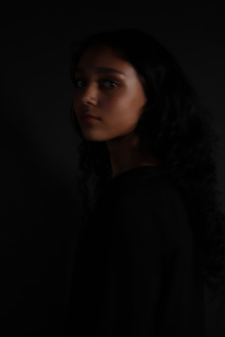
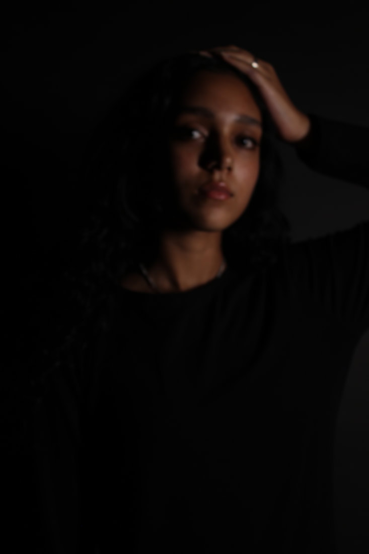
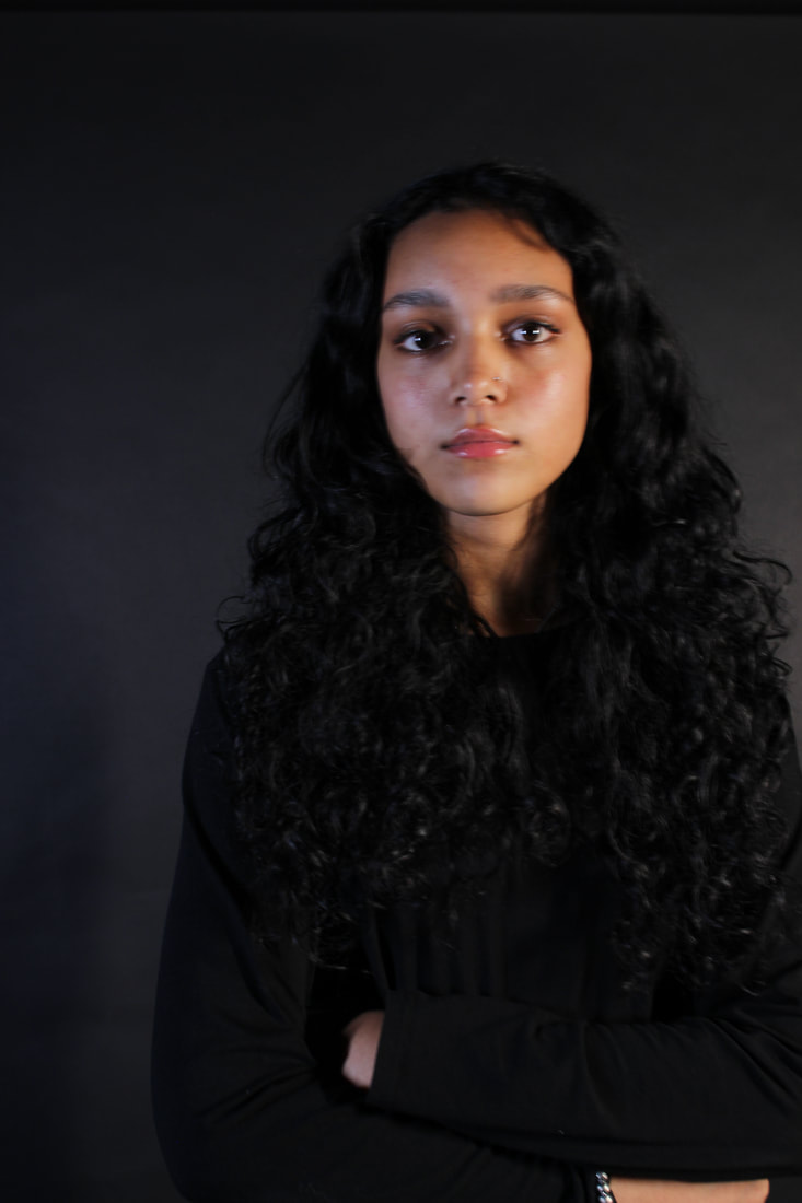
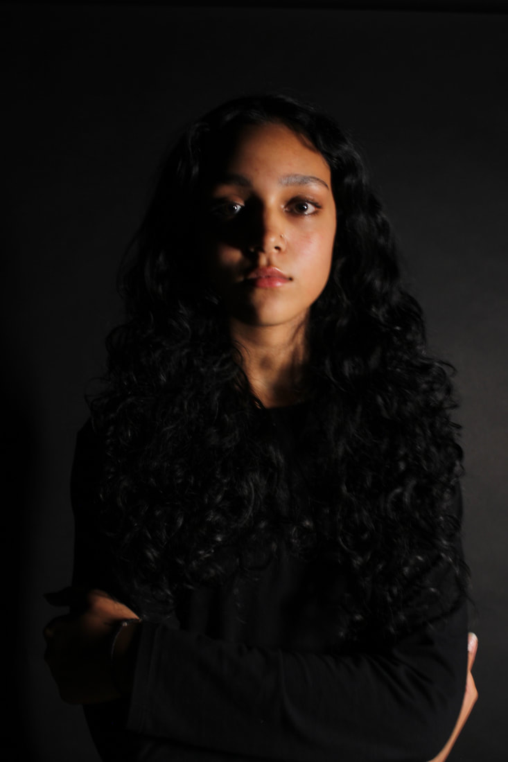
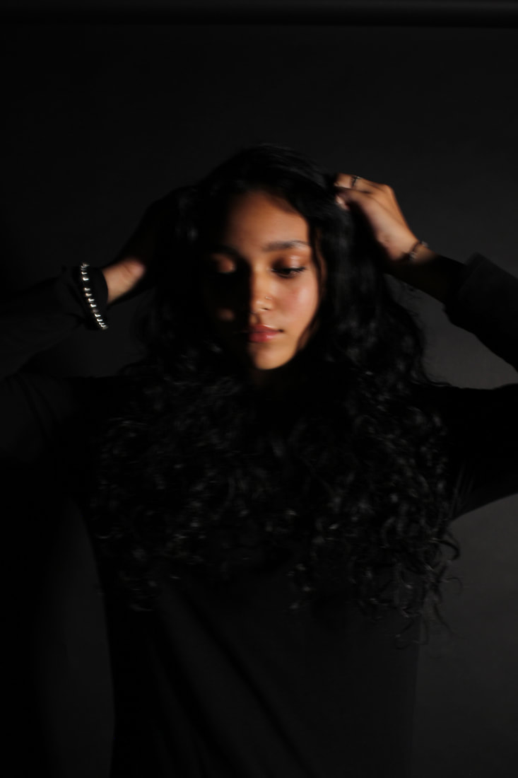
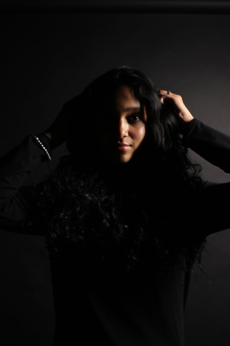
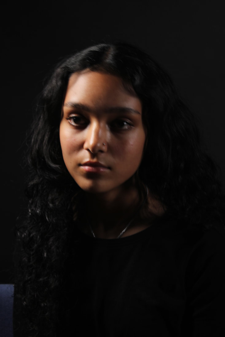
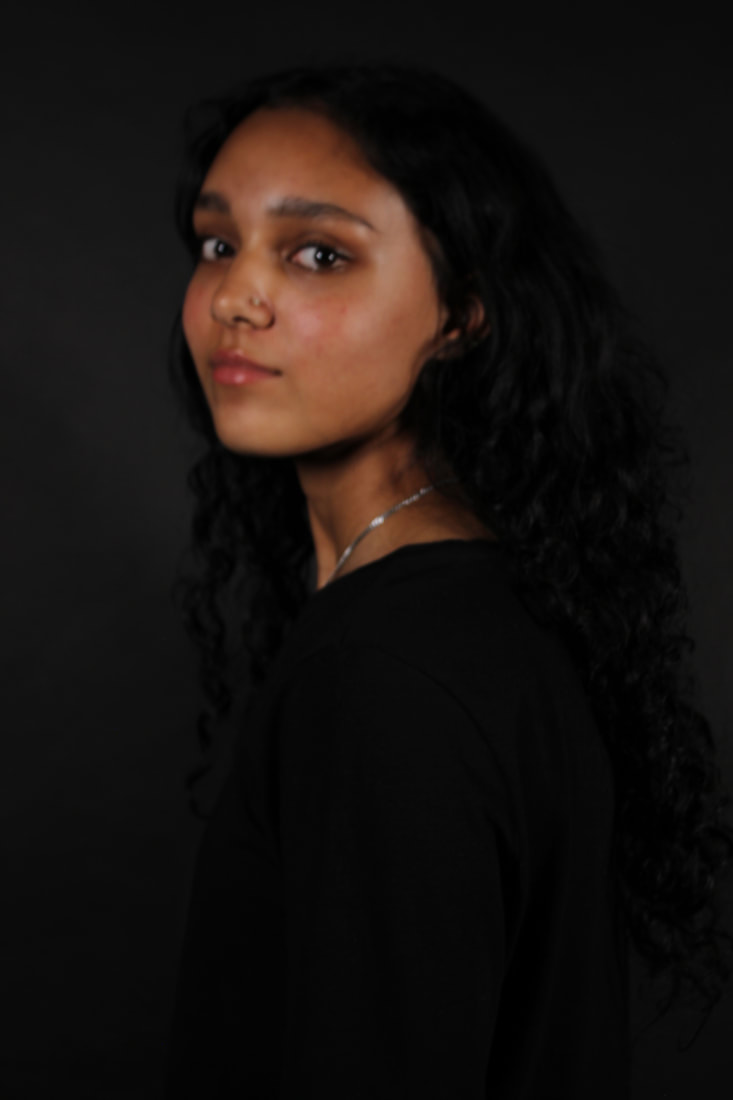
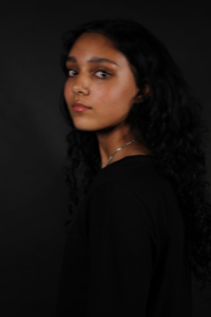
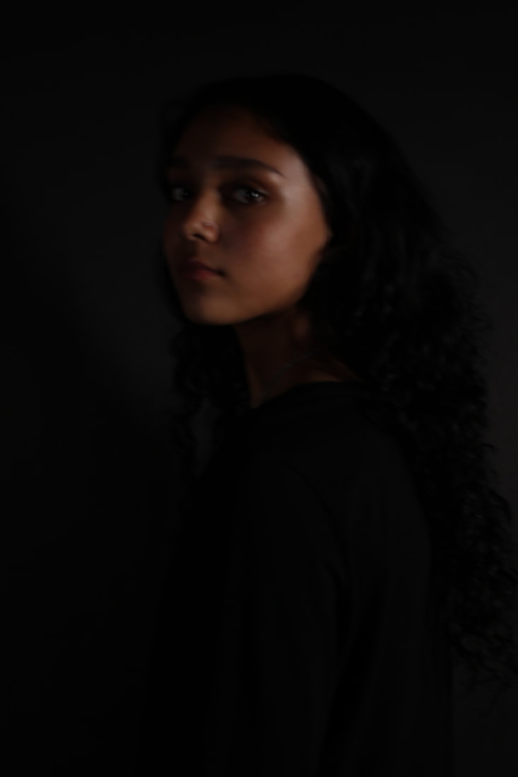
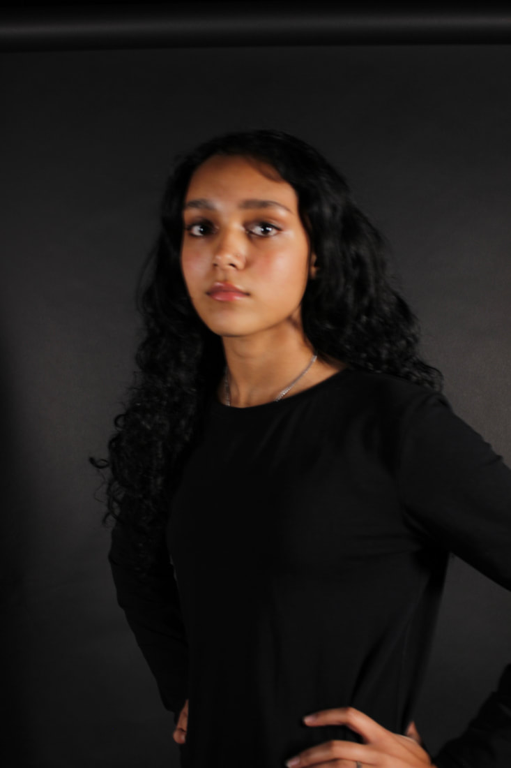
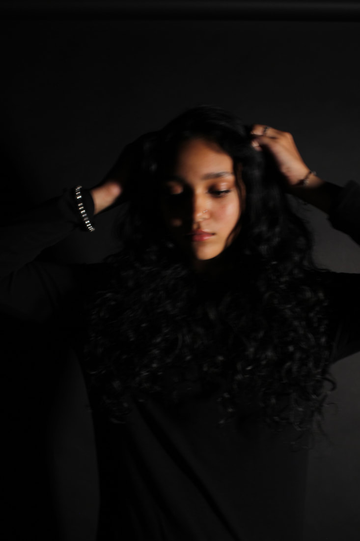
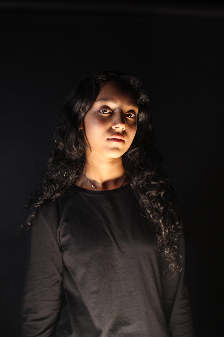
This second gallery is a small photoshoot I did for homework. It is very important to take images outside of school as well as in, so you can broaden your horizon and expand your understanding of photography. These photos fit in with my journey of this project because my overall message is feminism. My model is of course a woman and I have tried to make the model connect with the camera, so the later photoshop will have more of an impact.
To make these photos better, I think I should experiment more with lighting and poses that the model does. I could also try some different angles other than face-on.
To make these photos better, I think I should experiment more with lighting and poses that the model does. I could also try some different angles other than face-on.
Best and Worst

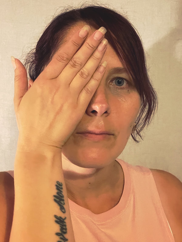
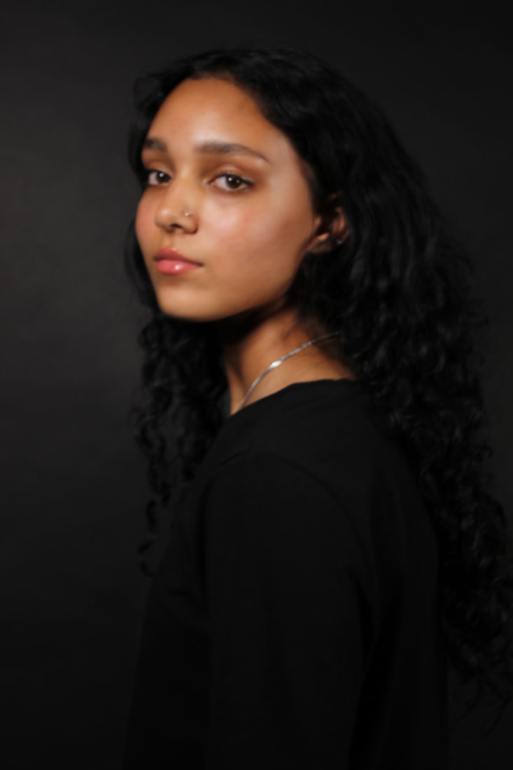
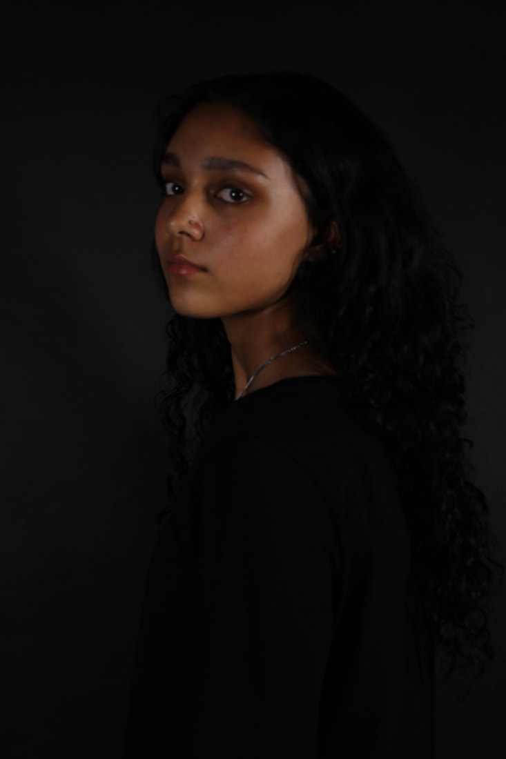
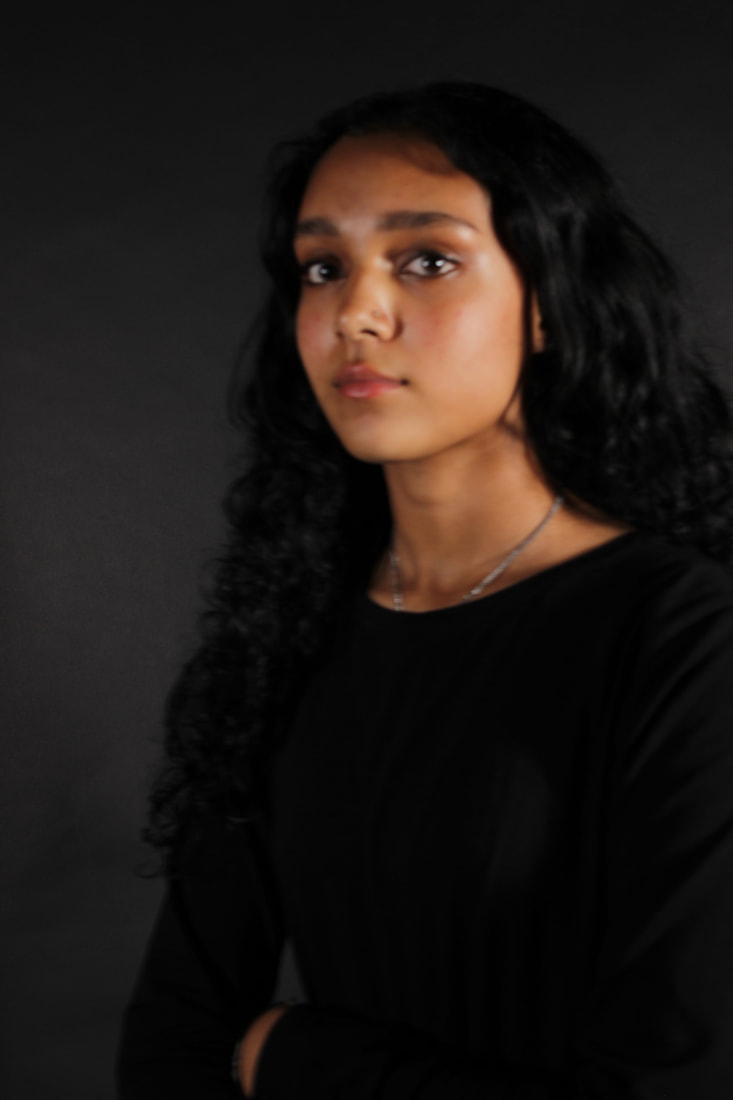
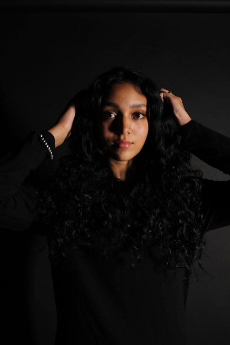
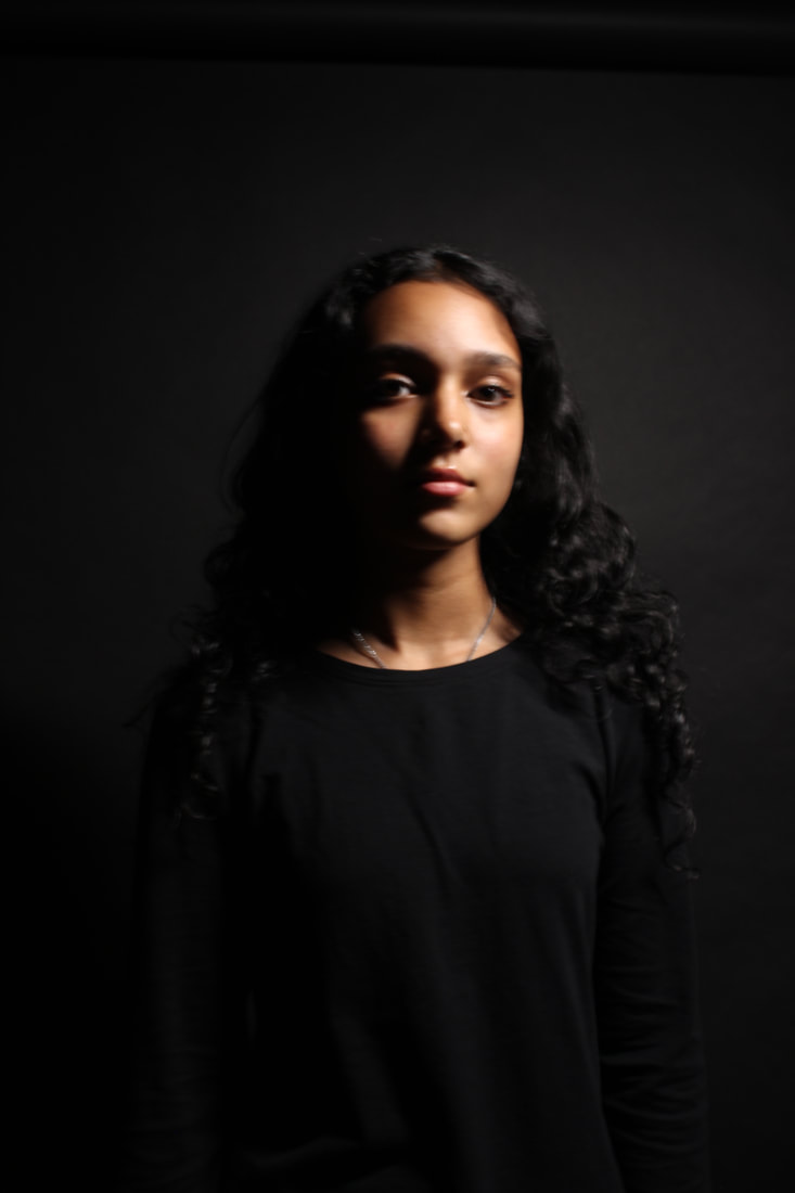
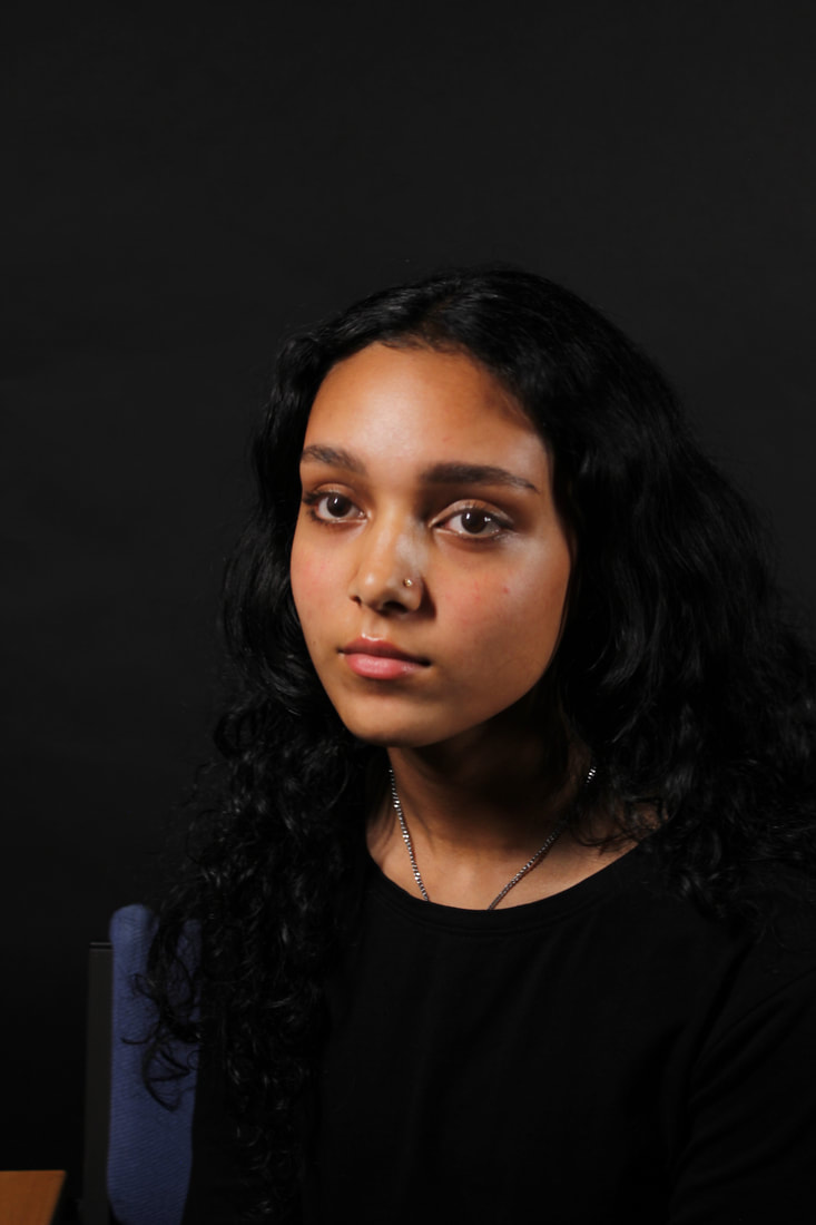
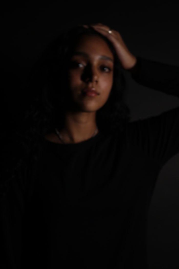
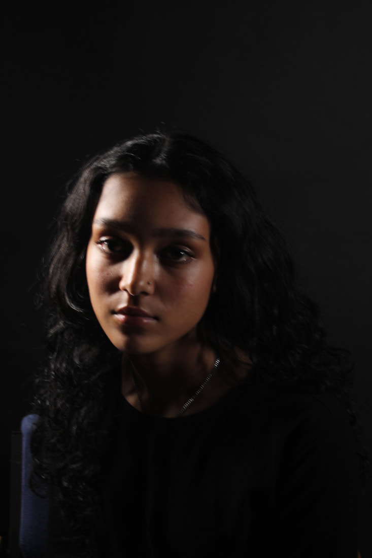
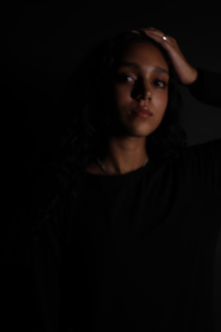
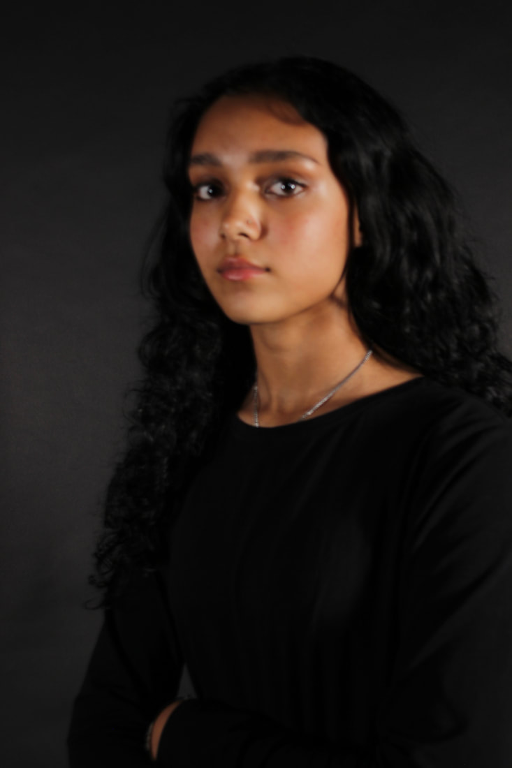
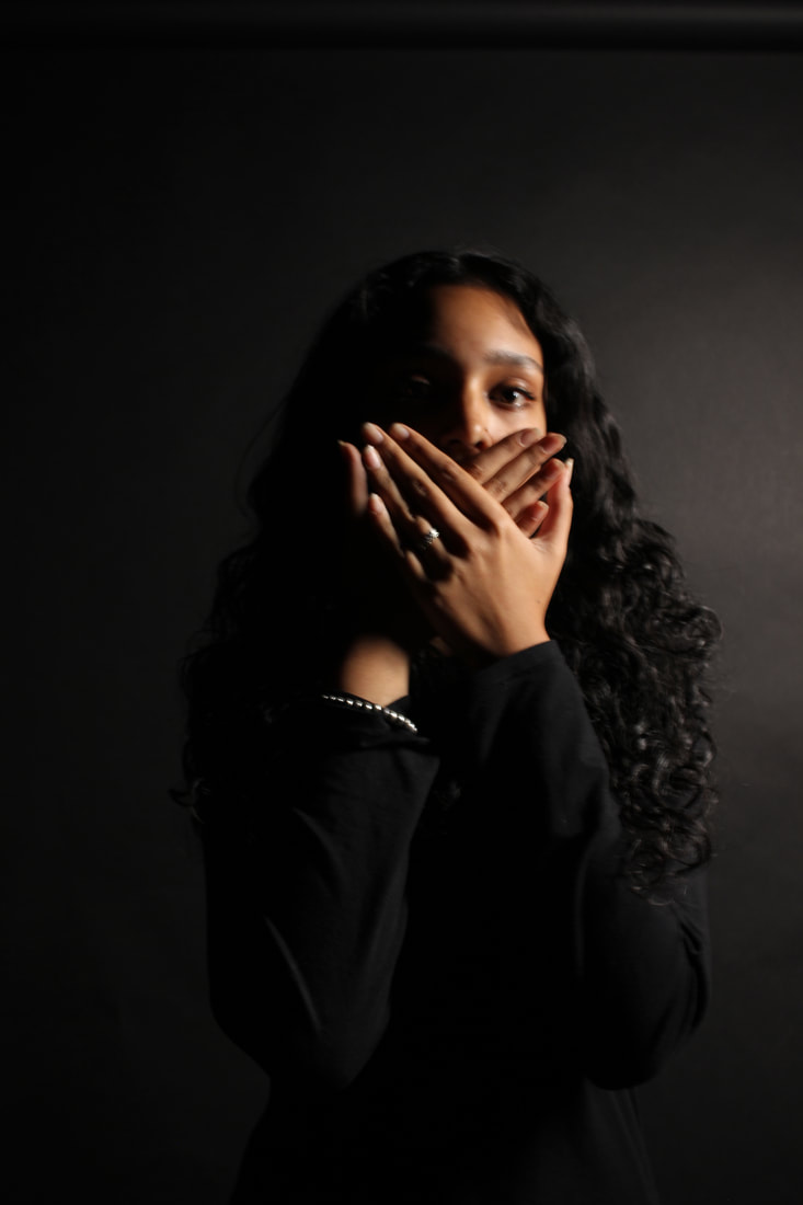
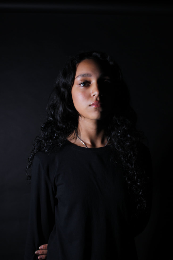
In my opinion, this is my best mage. The photo has a bit of a yellow undertone which outlines the textures of the model. The positioning of the model is dead center and the cropping is very tight which brings full focus to the model. The eye contact with the camera is very connecting and the pose of the models hands could be interpreted to the message of the project.
|

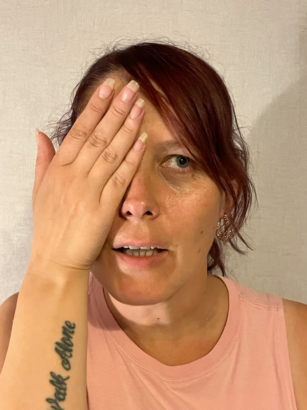
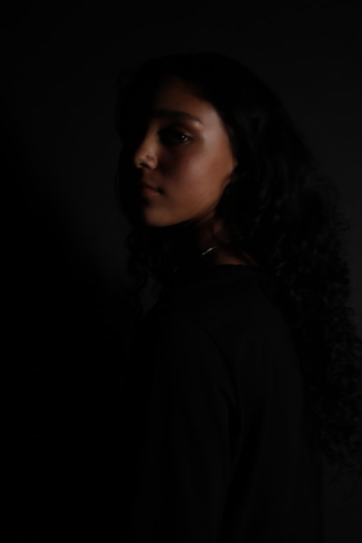
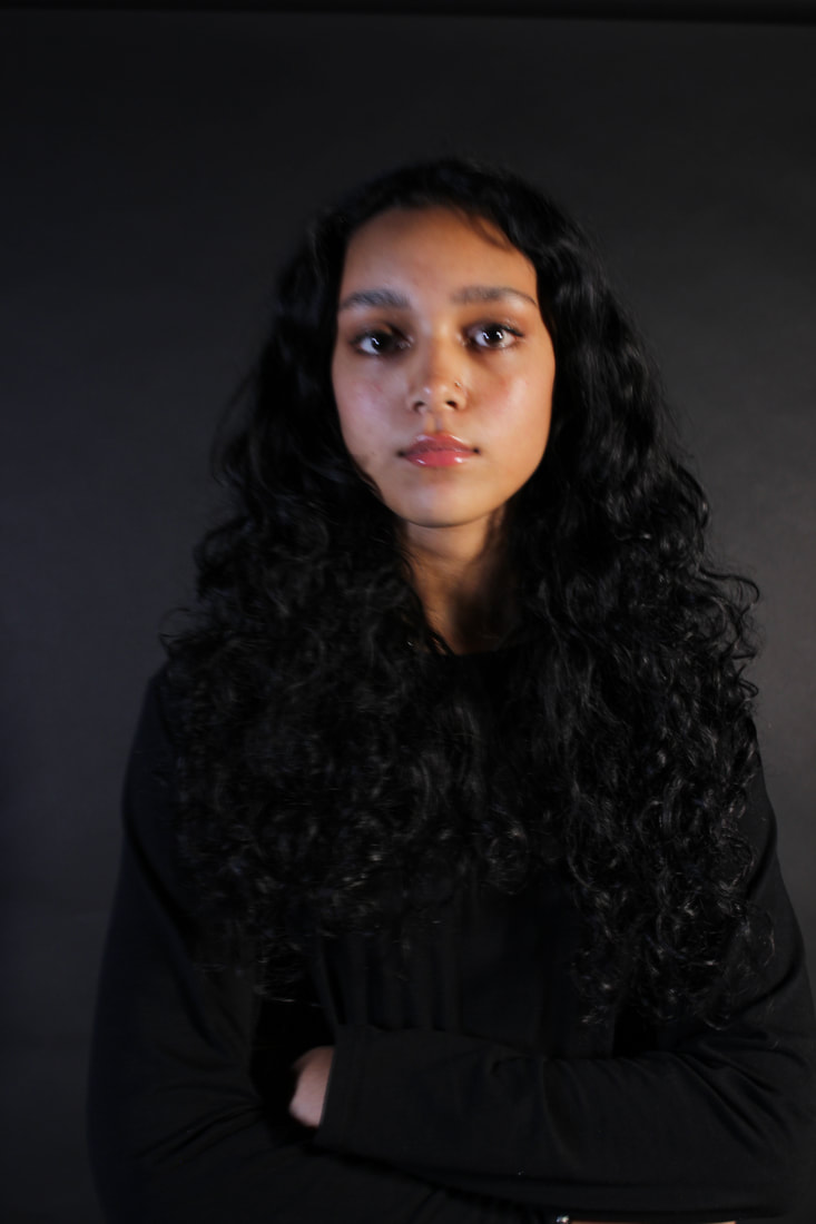
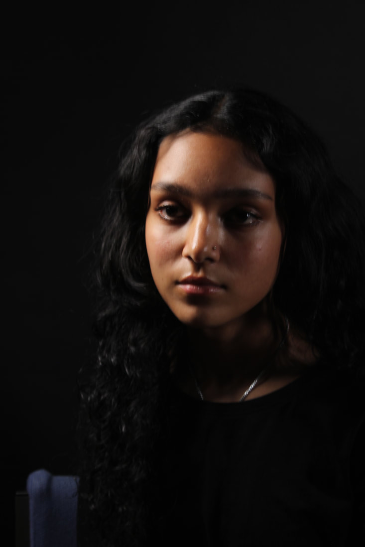
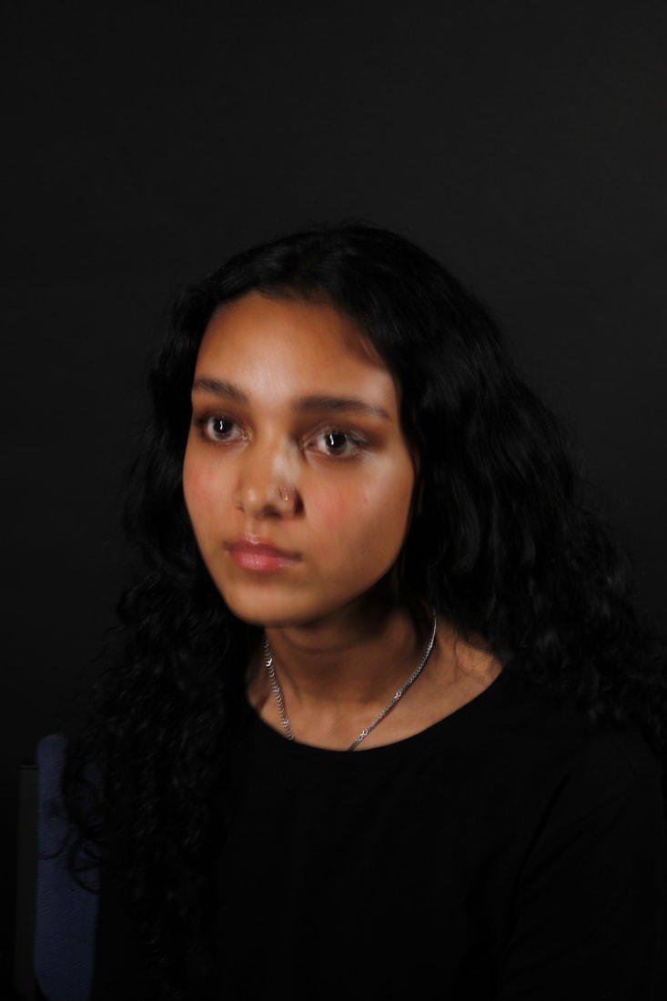
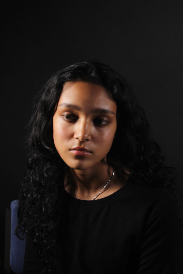
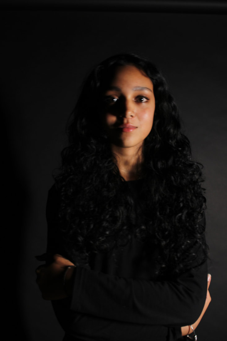
In my opinion, this is my worst image. The plain background gives the sense of an infinity curve, however the texture of it is quite grainy and doesn't compliment the image well. As the camera was quite far away from the model the makeup is not as highlighted as I would have liked. The composition and cropping of the image could have been better, so that the sides are evenly distributed.
|
Shoot plan
|
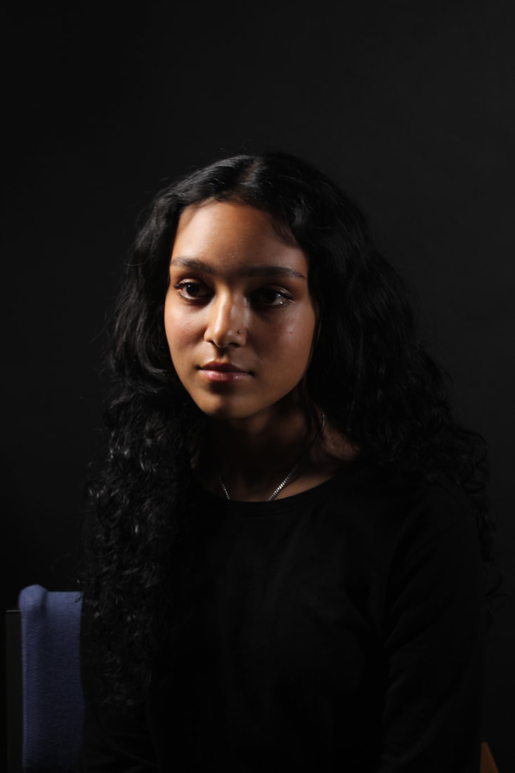
There is no specific photograph(er) that I am trying to recreate with this shoot. Liora K is perhaps the closest to what I am trying to accomplish, but her work is normally body focused. I plan to do this shoot at home in my own time, so this will be an indoor shoot using natural lighting as I did not have access to studio lights. I intend to use myself (self portrait) as a model for this shoot as it is easier to do and I can work to my own speed. I will use some natural makeup on myself with a white dress to make the photo come out more clean, but I also think the colour white compliments the message in this shoot well. To get this particular message across I will be using a sign that has the message 'Men of quality respect women's equality' written on it and it will be the main focus of the image. As this is a home shoot, I was not able to use the normal Canon DSLR camera, so I used my Iphone camera instead. Natural lighting goes well with the Iphone camera as it does not make photos overexposed/underexposed. I will not be able to change things such as the ISO and White Balance on a phone camera, but I will try and make the photos reminiscent to that of photos will ISO around 200 and a White Balance of 'Auto'. I intend to take around 30-40 photos, so I have enough for a final gallery.
|

|


Best and worst

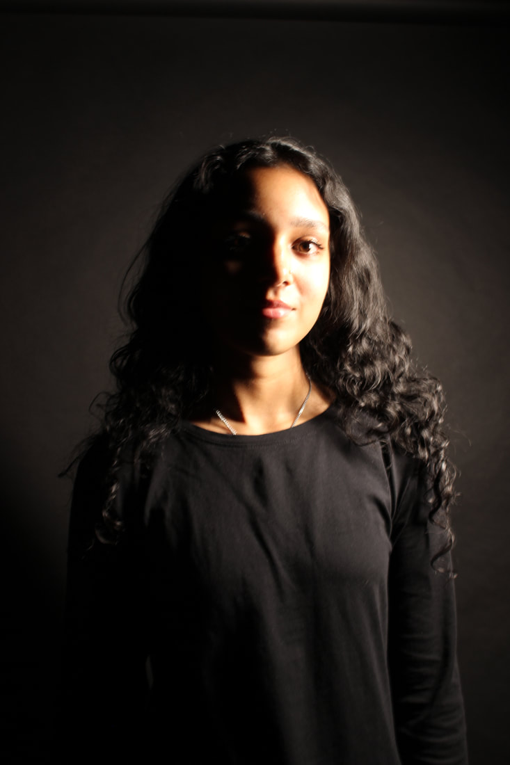
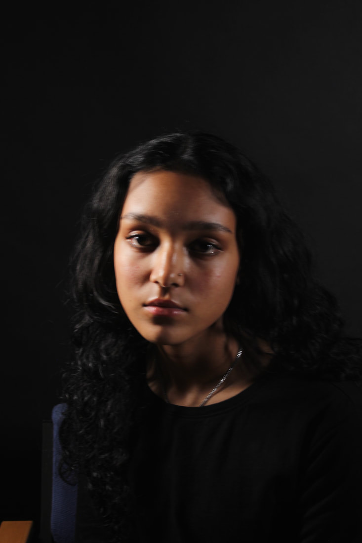
In my opinion, this is my best image. I really like the composition and framing of this photo as the model is on shot, but the top left corner is free for any additions I want to add in photoshop that match the Barbra Kruger style. The contrast of light and dark is very evident in this picture as the background a dark infinity curve and the entirety of the model is surrounded in light. I think the rule of thirds applies to this photo as the position of the sign acts as the center that lines up with the rule of thirds template.
|

In my opinion, this is my worst image. The models facial expression is not engaging and does not accent the theme of the photo. I feel as if the camera is too close/zoomed in to the model, so the framing is off. The center piece of the photo(the sign) is not focus which diminishes the point of the photograph. I also think too much of the models face is in darkness, so the light and dark contrast is not really in full affect.
|
Shoot plan
|
In this shoot, I will take inspiration from Barbra Kruger and try to make a statement with my images. The picture I looked at previously (in my opinion) was about beauty standards and the natural state, so that is something I would like to try. I am going to get shots from the shoulders up and mainly focus on stigma centered around makeup. My model will be one of my female classmates. The clothes that will be in shot will be block colours (preferably black). Makeup provided will be used on one half of their face to enhance features on that side while the other side stays bare. This will be a studio shoot, so my background will be plain and pale to give the impression of the infinity curve. The equipment I will use will be my phone in the first shoot and a Canon DSLR camera in the second shoot, perhaps with a tripod to reduce camera shake. Colourful lights will be used to create a new effect. A studio light will be needed in the shoot for my intentions to capture the entirety of the model's face. The white balance will be set to auto as the pictures are being taken indoors and the F stop will be around F/15 or F/16, so that everything is in focus. I want to take around 20-30 photos, so I will have enough to choose from for my final outcomes. The aim of this shoot and it's outcome is to portray a message of what society thinks a woman should be and what a woman may think of herself because of that society.
|

Inspiration:
|


School Photoshoots


Best and Worst

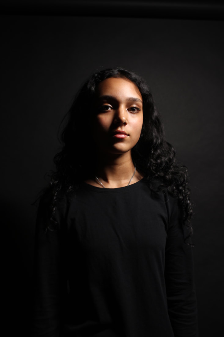
In my opinion, this is my best image. I think the framing and composition of the photo and the model's head positioning makes it a really connecting piece. The slight yellow hue of the studio light adds character and makes the glitter of the eyeshadow pop which enhances the facial features. The camera was quite close to the model's face in this image, so the infinity curve is even on both sides and that emphasizes the effect.
|

In my opinion, this is my worst image. I was experimenting with the ISO and selected the setting 'Shade' which made the image very underexposed. The studio lighting was further away from the model at this point which added to the darkness. The angle of the camera was off as the end of the infinity curve is in frame. I do not like the composition in the image and how the model is so far off to the side as there is too much blank space.
|


Best and Worst

In my opinion, this is my best image. The blue hue from the Tungsten setting give the picture quite a tense aura that compliments the models expression. The image is nicely cropped and the infinity curve is even on both sides. The direct eye contact with the camera makes you connect with the image more. Everything is perfectly focused.
|

In my opinion, this is my worst image. I was experimenting with the ISO and as you can see 200 is not the appropriate setting for indoors with little studio light at the time. The angle is also not ideal as the model is not really connecting with the camera. The darkness is too similar to the models clothing for them to stand out.
|
Shoot plan
|
In this shoot, I will be taking standard portrait photos from the torso and upwards. This shoot will take place after school with one of my friends as we needed a dark space that a normal classroom cannot provide. The clothes that my model will be wearing are black so it will blend in with the black background and flow well with the idea of an infinity curve. The model will not be provided with any makeup as I want to give this shoot a feeling of unmasking and natural. Studio lighting will be used at different intensities throughout the shoot to give an array of different shots. I will be using a Canon DSLR camera to get the best results and a tripod to stand it on as it can be quite difficult to focus images steadily in the dark. I will also use my IPhone camera for experimentation. As it is indoors with minimal lighting the White Balance will be set to auto and the ISO set to around 200, but I may experiment withy those. I will take around 30-40 photos (perhaps more as we will have more time than in lesson) so that I will have enough to choose for refinement. The aim for this shoot is to, once more, give the impression of a Barbra Kruger piece as her work is very representative of what my project focus is.
|

|


|
|
|


Best and Worst

In my opinion, this is my best image. I think the portrait angle worked best with this shoot as the infinity curve is in full effect and the perfect amount of the models body is in frame and is cropped correctly. I feel like the black on black was a good decision as it makes the light of the picture stand out more. Leading on to lighting, having half of the model in light and half in darkness makes the image quite eye-catching and the eye-contact with the camera makes the image very connecting.
|

In my opinion, this is my worst image. I do not think the landscape angle works all that well. The studio lighting was not at the correct angle and was too sharp. The white balance and ISO does not fit with the darkness of the room. At this point in the shoot, I did not have a tripod and the darkness of the room made it very difficult to focus, so the camera shake is very evident.
|
Shoot plan
|
This shoot is for after school hours as this means more opportunities to use professional equipment. I plan to use 2 studio lights with flash and coloured gels on them to make the image outcomes very eye-catching. The main colours I plan to use are red and blue as those colours are quite the opposite of each other and that might make the photos more intriguing. I may also experiment with other colours, such as purple. These colours may create leading lines where they meet on the model. A black background will be used to give the impression of an infinity curve. A blank background is necessary as I want the attention to be on the model in the centre. The model doesn't have to wear anything specific as I want her to have her natural style to fit with the theme of empowerment and making your own decisions. The pictures will be taken is portrait mode as I want to capture the model from at least the torso and up. I would like to use a tripod, so the pictures can be as sharp and clear as possible. I will aim to not photograph the bottom half as the floor will be visible. I aim to take at least 20-30 photos, so I have options to choose from for photoshop developments. My aim for this shoot is to have a model that represents the portrait, simple nature of someone like Abigail Heyman, but put my own twist by involving colours.
|


|


Best and Worst

In my opinion, this is my best image. The blue/purple studio lights really compliment the models clothes in a way that makes them look like they are almost protruding from the infinity curve. The overall composition and framing of the photo is ideal because it leaves room for later photoshop developments. I like that the model is not staring directly into the camera as it offers a sense of the photo being even just a bit natural. It is a very clear and focused image.
|

In my opinion, this is my worst image. This was one of the first images I took, so it was the experimenting stage. The lights were not the correct intensity and I think the red coloured gel on it's own does not really fit with the feel of the photo. The image overall is so dark that the black void of the infinity curve is ineffective.
|
Shoot plan
|
I used two models for this shoot as they were both available, so the number of models in this shoot differ from my others. It would be ideal if they were wearing black clothing with (perhaps) small details on that shine prominently in the sun. I chose this an an outdoor shoot as the natural lighting could be nice with any possible shadows. The lighting could be difficult to manage as I cannot manipulate it. I wanted two different backgrounds for this shoot, so I decided to do a textured one, for example a brick wall and then one with more natural elements, for example trees. I used a Canon DSLR camera and the ISO will be set around 200. I plan to experiment with the White Balance as the lighting may change. Switches between landscape and portrait will also be noticeable. I will also use my IPhone to get two possible different outcomes with my photos. I plan to take an array of at least photos, so I can choose to work with different ones in photoshop. I hope this shoot captured the more natural side of the models as there was no studio input involved.
|

|


Best and Worst

In my opinion, this is my best image. The model is clearly having fun and engaging with getting the photo taken, so the pose looks more natural. The lighting also adds a sense of realism to the picture The different levels of natures make the photo more enticing. The positioning of the model in the right hand corner draws your eye towards then, making the rule of thirds noticeable.
|

In my opinion, this is my worst image. The lighting is quite dismal and does not add anything to the picture. The model does not look prepared for the picture and although it does look natural it is not in focus, so it does not give it's full effect. The background is also quite boring. The composition of the set up of the picture as a whole is not very intriguing or imaginative.
|
Development 1
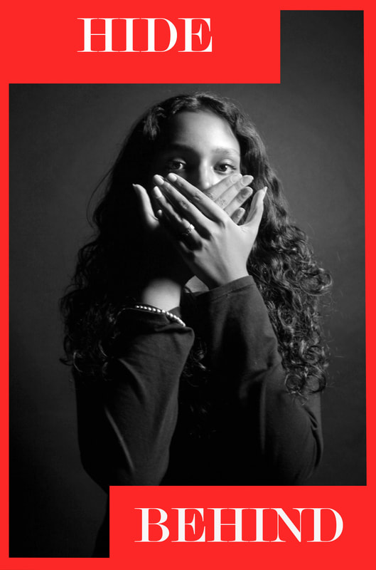
The inspiration for this final image was the style of Barbra Kruger. It was the first time I incorporated writing tools in photoshop. I think the inverted side of the final image passes off a message of hiding away from others and the text is there as almost a thought track and a rhetorical question to make people viewing the photo thing about the meaning. I also used a tutorial to get used to the Barbra Kruger style.
Tutorial
|
https://www.youtube.com/watch?v=FfKGtMCATMI
|

|
Original image
|
|
|


Final image

Development 2
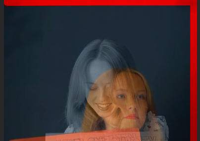
This was my first attempt at using double exposure techniques with pictures that weren't just landscapes. The effect being duotone really adds the the picture as it appears to be two faces. The photoshop technique itself is not really Barbra Kruger style, but I added the text to incorporate her style of work with something that I wanted to experiment with to make my photoshop outcomes more knowledgeable.
Tutorial
https://www.youtube.com/watch?v=oNGhX2d3zKg

Original images

|
|


Final image

Development 3
Keeping with the Barbra Kruger 'red and white' theme, I thought it would be best to constantly change where the text boxes are on the screen. This is vital to my experimentation because it allows me to see what works and what does not. I decided for this this development that I would stick to a classic Kruger style photo with black and white background and the bold colours that pop in the foreground.
Original image

|
|


Final image

Development 4
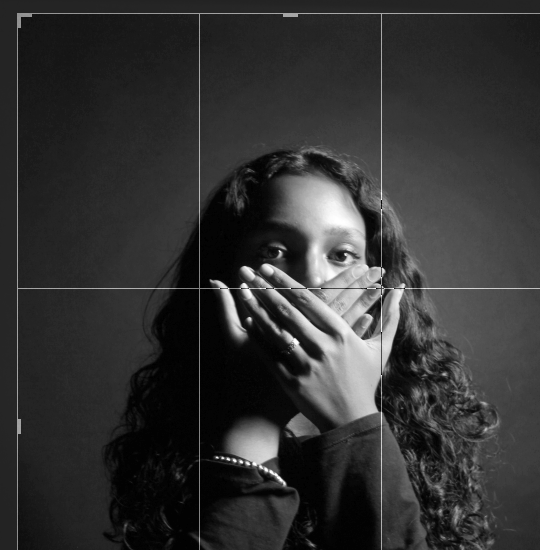
This was the first photoshoot I did outside of school time, yet still in the school building. I wanted a dark room, so studio lighting would stand out more and when I turned the photo black and white is would have a macabre feeling to it. I decided I had to experiment with putting the styles of writing on different areas of the images to make the outcome more intriguing.
Original image

|

|


|
Final image
Development 5
This is the second one of my images that I have experimented duotone double exposure with. The first experimentation, I used the tones of green and red as those were the ones showcased in the tutorial, However, as this was my second time doing it I felt a bit more confident in trying different buttons in photoshop. To make the refinement flow with the rest of my project I have added a red outline, so it matches with the Barbra Kruger elements.
Original images

|

|

|

|
|
|
Final image

Development 6
I tried to use some of the drawing tools in photoshop for this development as I do not particularly take advantage of them. For this, I used the smudge tool as I felt it could represent unkemptness and zero control over your person; tones that closely relate to my theme. The smudge effect also went with the original image as the models face is slightly out of focus. Once again, I have stuck with the idea of using the red outline.
Original image

|
|


Final image

Development 7
This is my third use of duotone double exposure as I really enjoy the process and putting it together and the outcomes are always fascinating to look at. You can see my development with using the technique after each outcome and how I have improved. I will stick with the red outline for each of my outcomes, so that each test of photoshop can interconnect and everything flows smoothly.
Original images


|
|


Final image

Development 8
The original image is bright and could be interpreted as a joyful picture. However, the text makes the photo connect with my project more. I have tried to do a mix of developments for my final gallery and along side the duotone double exposure is the cropped, outlined technique. This development fits in with the latter.
Original image

|
|


Final Image

Development 9
This ninth development was a swift and familiar process which proved to me that throughout this project I learnt how to do a specific development. I stuck with the black and white theme and the red and white boxes/writing. The outcome of the black and white is quite grainy which is something I would go back and change as I prefer it when it is much smoother. I have made mini collections of each outcome in how they are cropped and this outcome will be lined up with the outcomes that resemble boxes.
Original Image

|
|


Final image

Canva template
During this project, I slightly underestimated the time it would take to create a piece of work outside of that on a computer. As it reached the end it became clear I was not going to complete the physical copy of a photo book, so I was recommended a website called 'Canva' which allow you to create book templates with the opportunity to get your creation printed. The following screen grabs are from the pages I created on the website using my images from this project and some quotes relating to feminism from (mainly) pieces of classic literature.
This is what I was seeing whilst creating the photobook template


Final Gallery


Evaluation
The question I chose to dive into for this project was 'messages'. I knew I needed to choose a specific message that I held dear as I would be able to put all my effort into representing it in my photos and writing. After long consideration and idea sharing, I chose to focus on feminism. Doing this has allowed me to be creative at my own pace and improve my skills in independence. Creating photos that subtly represent issues in the lives of women has been a great experience for me growing up as a young woman myself. Women's issues and right to their identities has always been a subject I feel strongly about, so I thought it was be a good and sensible idea to dedicate my first personal project to a movement that I think will change the world for the better.
My favorite part of this project was going along with my own photoshoots that I prepared. Working with different models that I know personally and being able to come up with ideas with them whilst the photoshoot is in motion has really made the process flow a lot easier and made me more motivated to complete everything to a high standard. There was one photoshoot set up after school hours with a professional photographer which I fell added so much to this project and made the high standards standards look very persistent. Working with said photographer allowed me to learn more about the process of setting up camera equipment, backdrops, lighting and the communication behind the scenes between the model and the photographer taking the pictures.
I feel as though the techniques I used on photoshop really developed compared to my starter 'Texture' project. Using duo-tone double exposure and tools along the sidebar (such as the paintbrush and smudge tools) is something that I had not done before and it was very beneficial to have tried techniques that I have not explored before. Using tutorials for these techniques helped solidify the knowledge in my mind. This project also differs from my last one because I chose to try and involve developments outside of photoshop.
I would really like to further improve my manual skills with a camera. The difference between my shoots and the shoot with the professional photographer is very evident as that shoot resembled one carried out in a professional manner. However, I feel that was just a learning experience. For my next project, I think I want to have more use of a tripod as one of my main issues is camera shake. More experience with a manual camera will also give me more insight into things such as the ISO and the timing for each setting. Also, I wish to still improve my photoshop developments and you can definitely see my progress throughout each project and I want to further that progress even more.
The three photographers I chose to research were Barbra Kruger, Abigail Heyman and Liora K. It was important to me that the artists I focused on were of course women. The photographer whose work I tried to incorporate the most was clearly Barbra Kruger as I think her work is the most recognizable and is very linked with my project. The bold red and white writing is very effective and gives a bold message across. I experimented with different ways to put the writing and kept a red outline on the photos consistent throughout. Abigail Heyman's work are photographs that are quite traditional and my photos before the photoshop developments could be described as traditional. Lots of her work is in black and white which I have tried with a few of my outcomes. With those black and white images I tended to add an outline as previously said as I wanted to mix my chosen photographers work together. My final photographer was Liora K. Her work is also about stating a clear message with writing, but writing that is on model's bodies. I mainly focused on my model's face and I thought it would make the image more connective and personal. The messages I wrote were inspired by hers as a lot of her work is on empowerment of women. Again, her photography is in black and white, so I mixed it with the likes of Barbra Kruger to give it that extra pop and intriguing nature. I feel as though that with each outcome that I have made, each photographers influence is very clear
During this project, I really enjoyed finding a photoshop outcome that I actually liked applying. The mirroring technique I used with my texture project was a fine choice, especially since it was first ever photography project. However, with this project the outcomes connected with me more and the method to get the outcome on photoshop was so simple, yet so effective. The red outline and white writing was my main effect, but my favorite was the duotone double exposure as there is a lot to investigate within the pictures. With 'messages' I feel like I really found my rhythm and created galleries I am genuinely pleased with.
I feel the most successful part of this project was the photoshoot with the professional photographer. As their equipment was high end and involved more technology (such as a computer) the images came out very clean and we had a lot of good ones to choose from. If one of the images did not come out to a high standard, it was because of lighting issues which I just used as a learning opportunity to learn more about the surroundings of a photoshoot. I feel this shoot was the highlight of them all as you can see the array of things I have learnt over time.
Figuring out my exact plan for the notebook was mainly my only difficulty. I was very excited to do that part of the project and I did have ideas for it, though I just found it a bit difficult to verbalize those ideas. It was a lot of trial and error tying to figure out which pictures I wanted to put in the book and how I wanted to present them. Timing to finish the notebook also limited me as during lesson I was focused of completing other parts of my project whilst I also did not have a lot of time out of school to work on the book. This lack of time and a website recommendation from my teacher (Canva) lead me to create the online book template that gives an idea of what a physical book project could have been.
In this project, I was learning with every decision I made, but I mainly learnt from looking at the pictures I researched and watching tutorials on how to do the developments on my own images. I put a lot of effort into choosing the edits I wanted to do and learning exactly how to do them because it is important that the things the tutorials teach me stick in my mind. For example, I figured out that I really enjoy the layout of photos created by Barbra Kruger and the way to recreate those images is now imprinted on my mind. I also learnt from what other people were doing. Students who were also doing the 'messages' project helped with sharing ideas for research and photoshoots.
If I were to try this project for a second time around, I would definitely focus on my time management skills. I feel as though when we were on the road to finishing this project before December the 16th I got too confident in the fact I believed it would be more than enough time. When it was down to the final couple of weeks I began to realize things may not turn out the way I envisioned them in the beginning with such little time left and so many ideas to try. Overall, if I would to complete this again I would think more strategically about my next steps and plan out how long each step would take me more thoroughly.
Mock exam
Developments 1
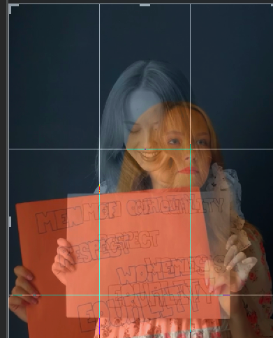
With the final outcomes I have completed, it is evident that there is a theme duo that I have been sticking to. Those themes are the Barbra Kruger outline and duotone double exposure. In the end, I came up with the idea of mixing the two together and combining and idea from my beginning mood board and a photographer that I researched. I did this so that my work would have some originality whilst observers are still able to decipher what I have been inspired by. With this outcome, I stuck to my same routine of: cropping images, Ctrl C+Ctrl V (snip taken from the internet as I was not sure how to present it), blending colours and then finishing with the red outline using the paintbrush tool. I tend to enjoy these outcomes as the inverted colours usually blend quite nicely with the photo, especially one that involved gel coloured lighting. The red paint really adds that final pop though one issue I find myself having is the paint begins to become transparent around the bottom of the photo and the bright colours as well as the models clothes are visible. This is not an immense problem as it is not the main focus of the image and it is not entirely noticeable, but as the person who designed the outcome I can not help but be aware of it. Overall, I feel as though this outcome is successful and links with the others that go along with this theme. However, I think anymore developments involving duotone will make it become repetitive.
Original images


|
|


Final Image

Developments 2
This style of outcome that I chose is most definitely heavily inspired by Barbra Kruger. I have included the entire style, such as the text box and red an white colour scheme, similar to others I have done before. I have used the smudge tool in this outcome as I wanted to create something to link with a previous outcome that I have done where I established the same idea. The curls in this models hair are great to convey an idea of unkemptness and the smudge tool further highlights that effect. I do that the effect the tool and the red paint has on this outcome, though I did run into a problem with the rectangle tool. The box and the red outline do not quite meet which makes a small black outline appear. Again, it is not a huge problem, but one I could most definitely fix for next time.
Original Image
|
|


Final Image

